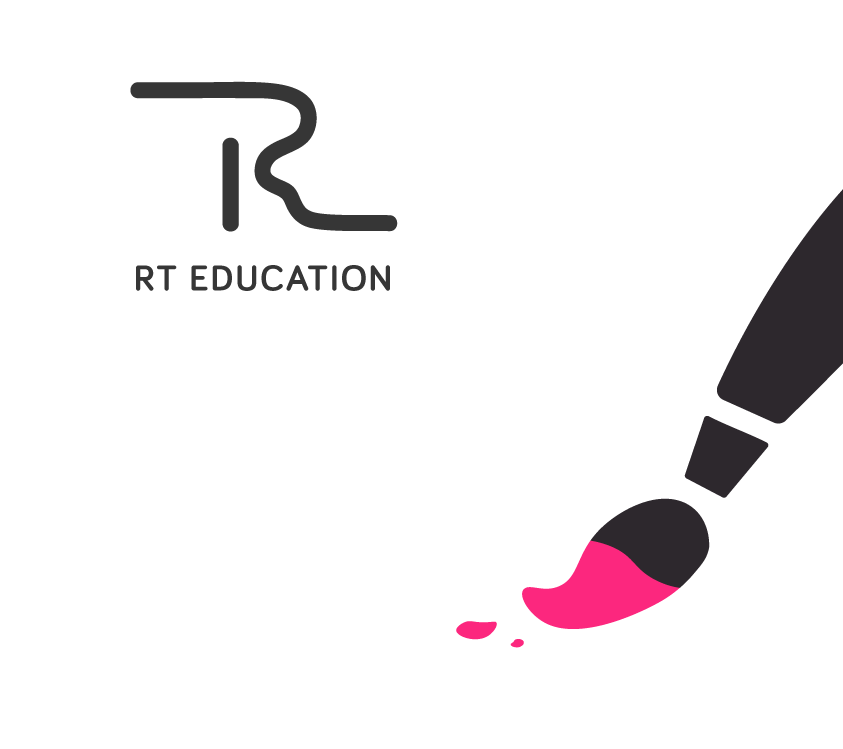
RT EDUCATION
WEBSITE + BRAND IDENTITY
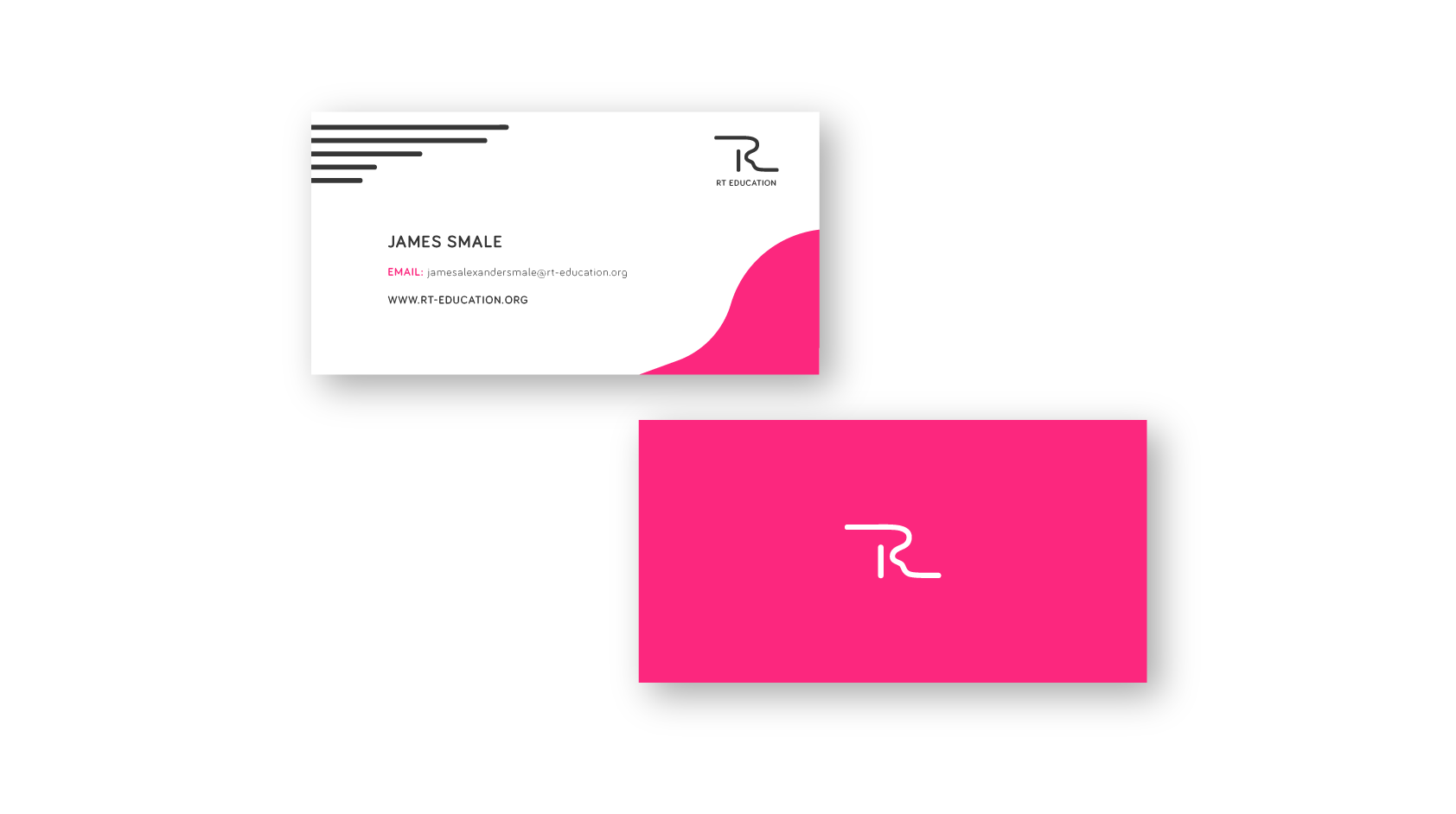
The company of music professionals, including music examiners at Trinity College London, offer teachings for both individuals who want to play an instrument for fun and professionally. In order for their business to move forward, they came to a conclusion that they needed a rebrand. They asked for very clean in style 'visual flavours', so we created a stylish mature look with a fun aspect shining through it. This was applied across the entire project; logo, business cards, website, icons, and social media assets.

Idea process
The rebrand was focused on cleaness and simplicity. The logo was to be more abstract but still symbolic to represent the artistic side of the company. The old brand identity was out of date, very busy and colourful. The style seemed to be aimed at children more than adults. RT Education offers sophisticated musical services that are aimed at various age groups, thus, the new identity had to be designed accordingly.
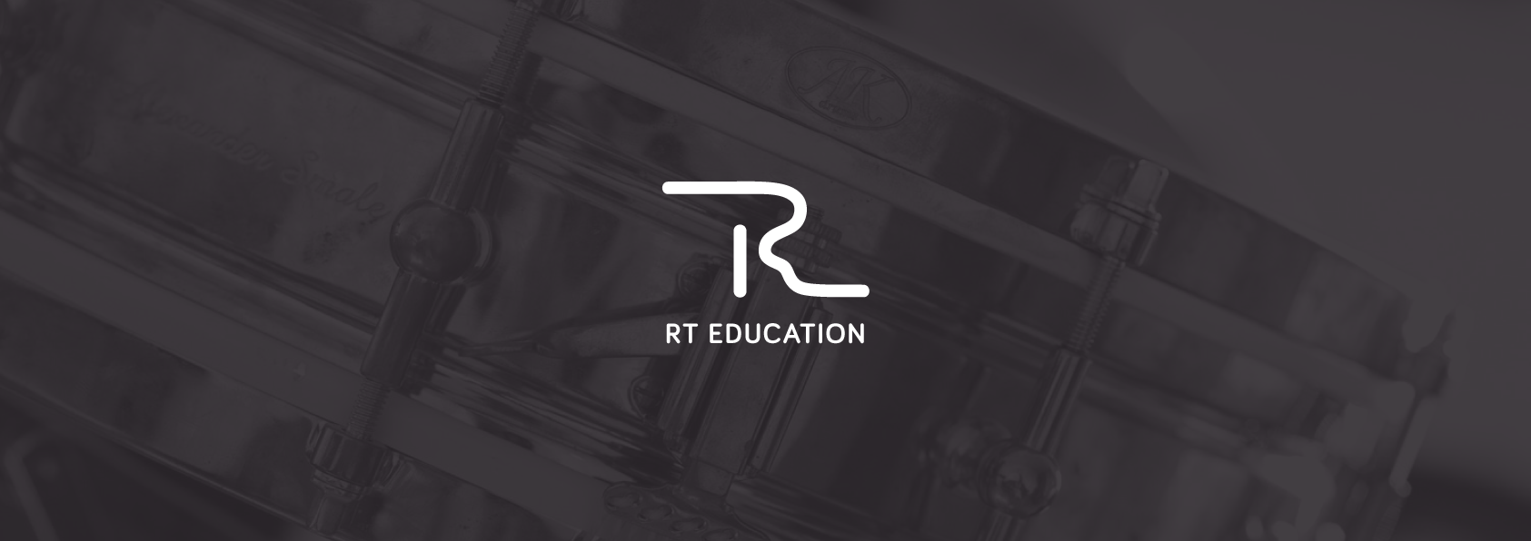
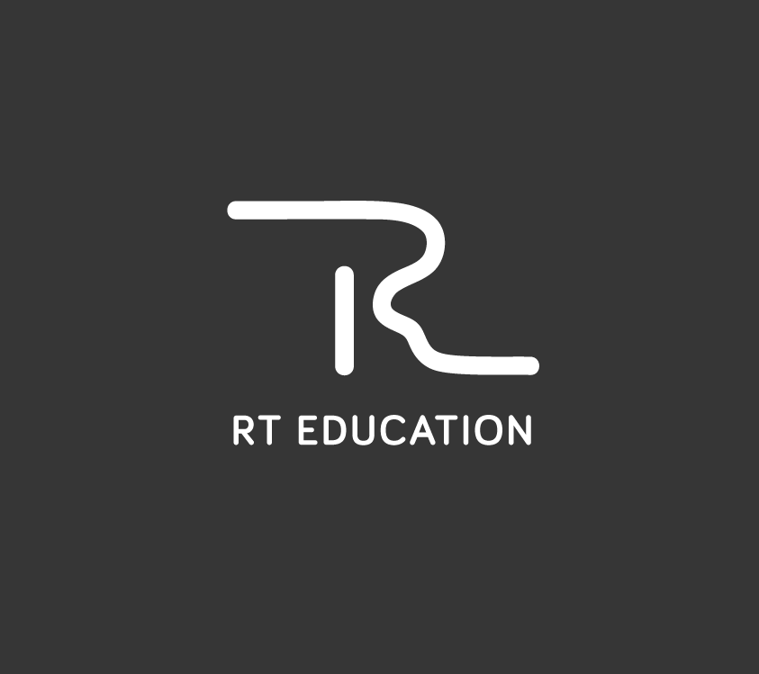
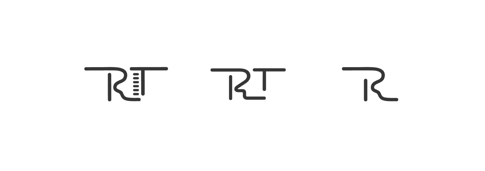
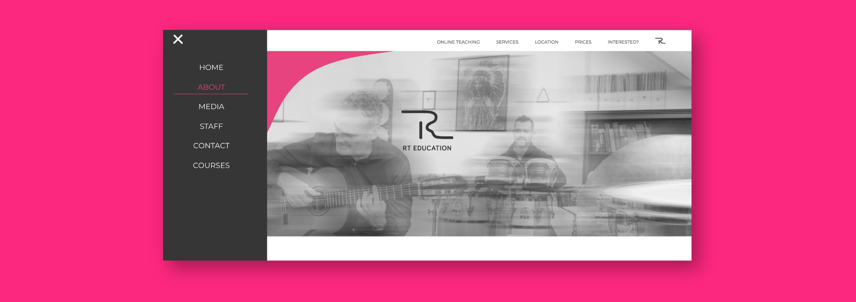
Initially, the logo icon was to show 'R' and 'T' separately. They were composed and shaped to convey a piano. The minimalistic and clean style that was intended for the company, drove us to remove the piano keys from the design, creating a simpler and more abstract shape. This still was not satisfying enough. The letters were creating a wide and chunky formation. The CEO of the company really liked the shape of the 'R' and immediately wanted for just this to become their logo. There is a 'T' shape within the 'R' design so it worked just like we wanted it to. They now have a clean, minimalistic and delicate logo, giving away their expertise in a mature, yet still playful, style.
IDENTITY DESIGN
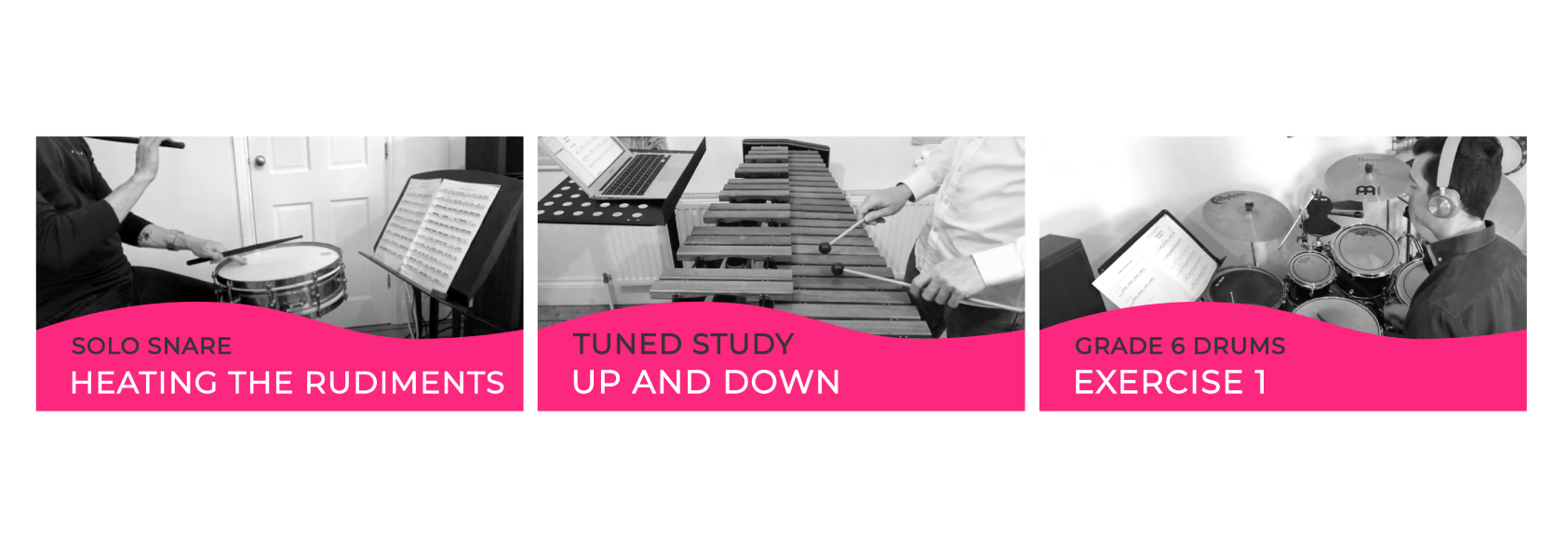
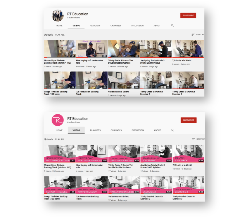
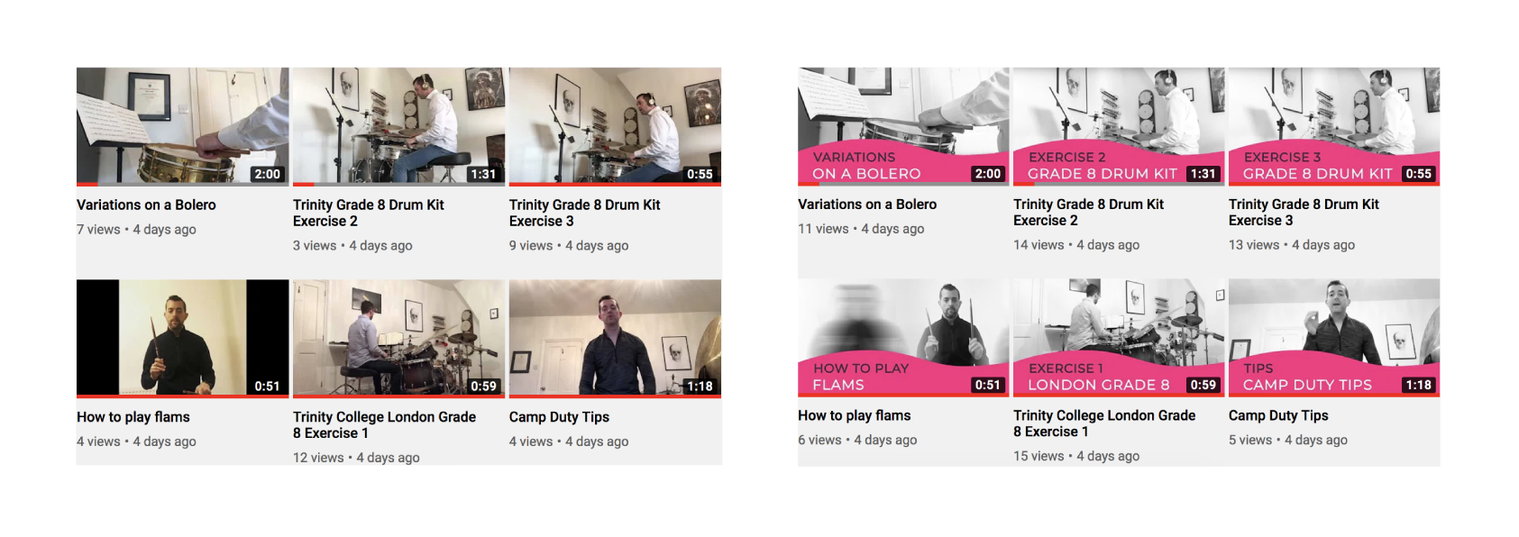
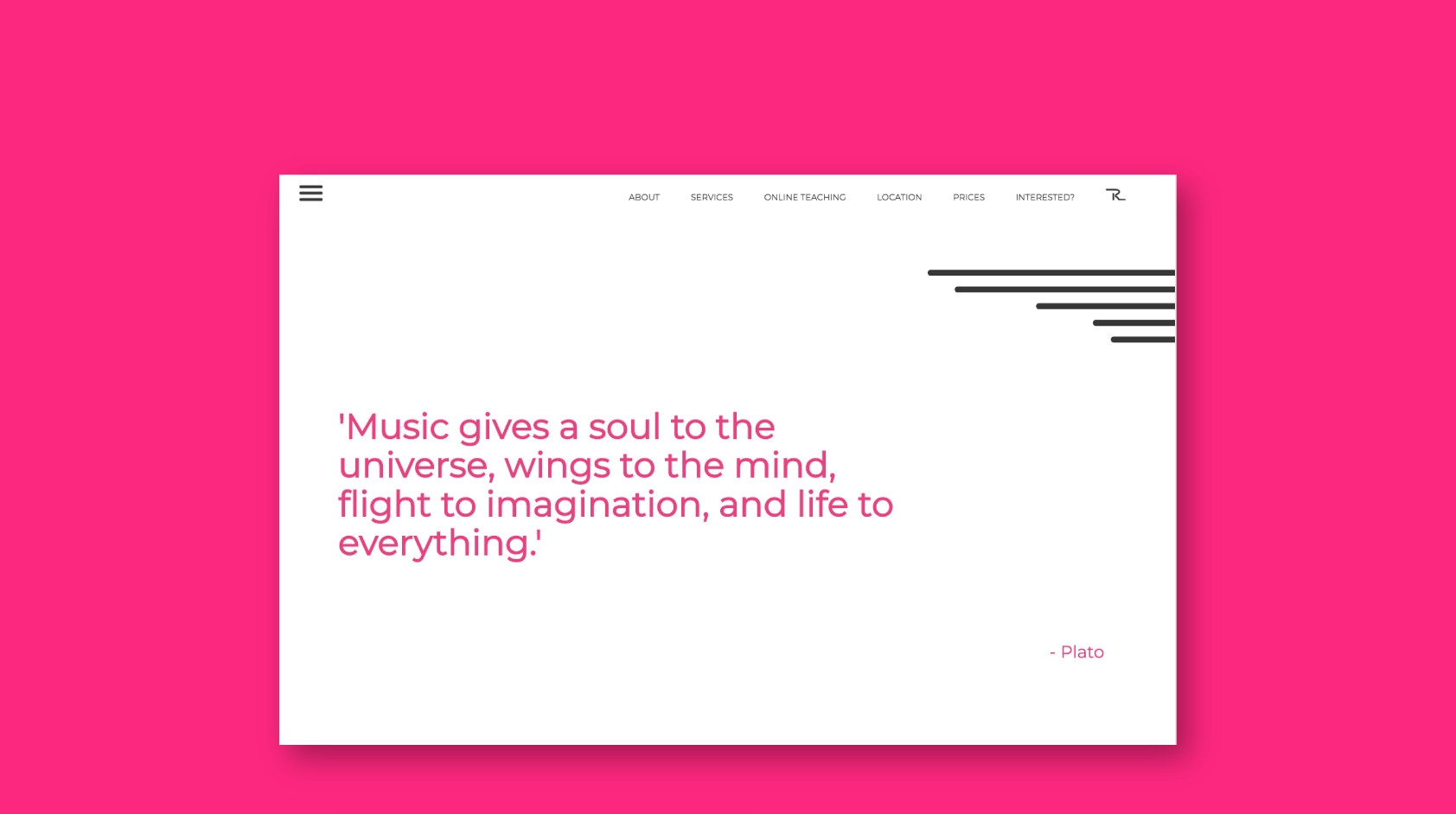
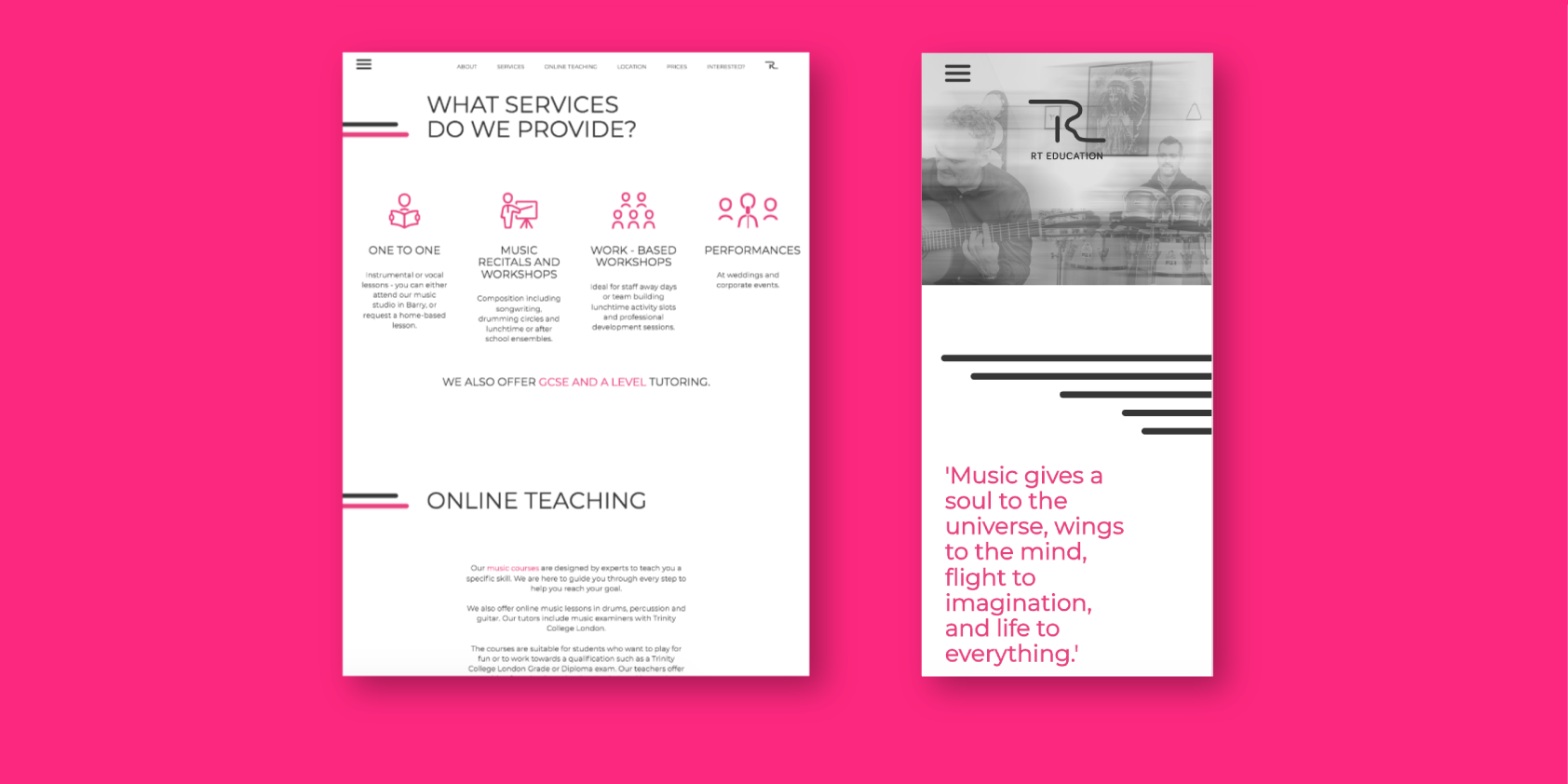
With the continuing inspiration by frequencies, a pink wave was designed to be used across the branding assets. The design was applied to business cards and banners, and was programmed to be animating on the website. This created a visual contrast and has given a fun and lively quality to the website.
The next identifying design created was a set of lines, resembling a music sheet stave. This symbolism brought out the company's expertise, and the design was used across the business cards and the website, where it was also animated.
To add a classical quality to the brand, any footage was edited to black and white, matching the grey shade in the brand colour scheme. This contrasted well with the pink graphics. Together, the designs created a stylish brand identity with a recognisable finish.
WEBSITE design
The website was needed as an asset for communication with customers, company promotion, and a list of information customers may want to know. The infinitely animating lines, highlighting the titles, and waves nearby the footer made this an exciting and dynamic piece to present.
Both animations were programmed in a slow, smooth, and dancing manner to symbolise movements of music beats, as well as a continuous flow just like there is in music. The website layout was designed to have lots of clear space for the content to breathe and to create a sense of cleanness.
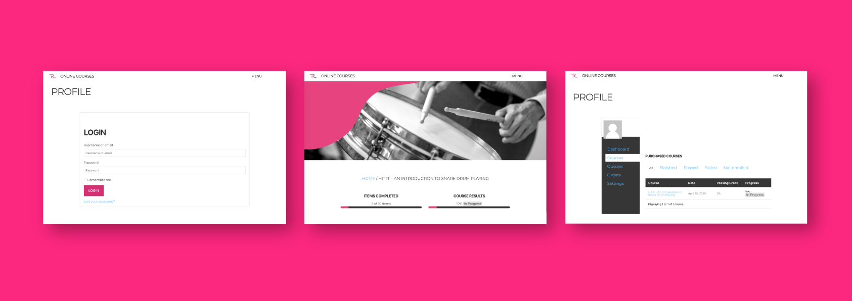
USER INTERFACE AND ONLINE COURSES design
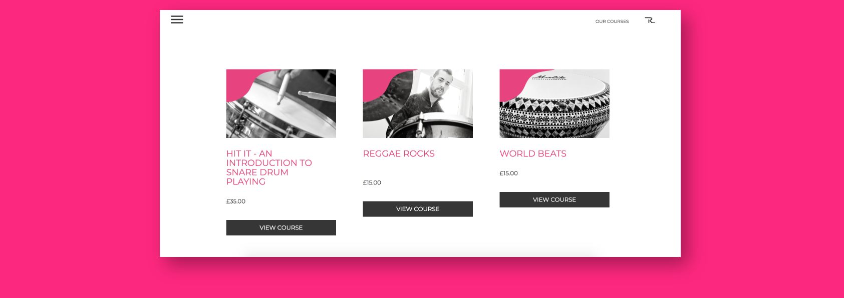
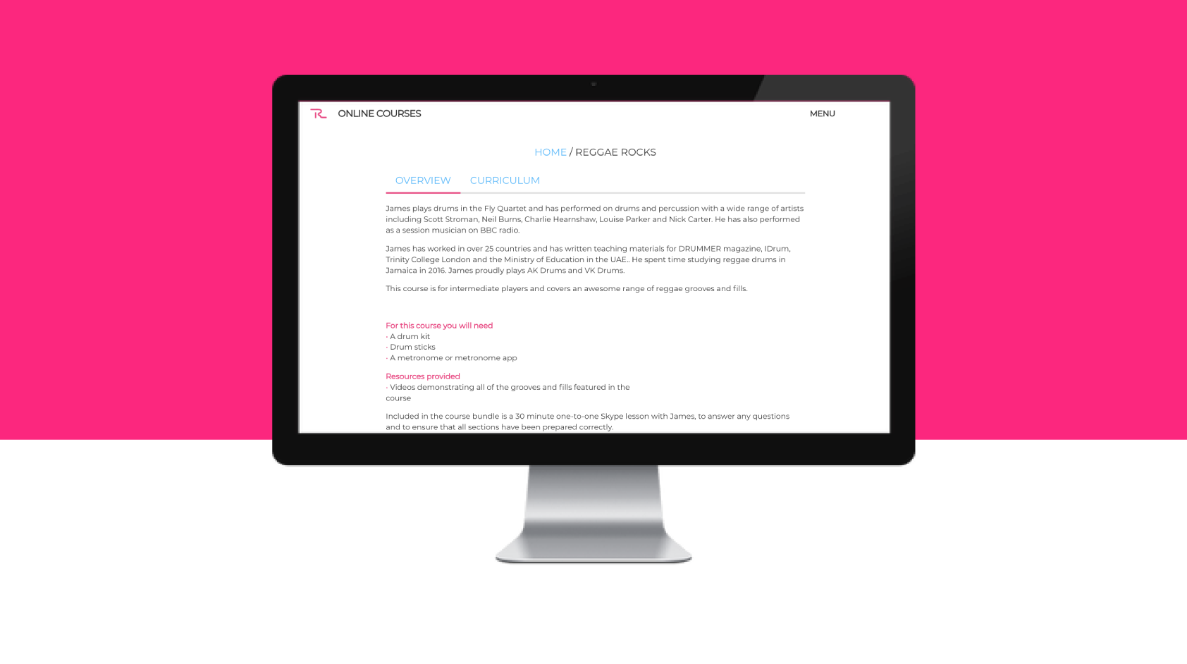
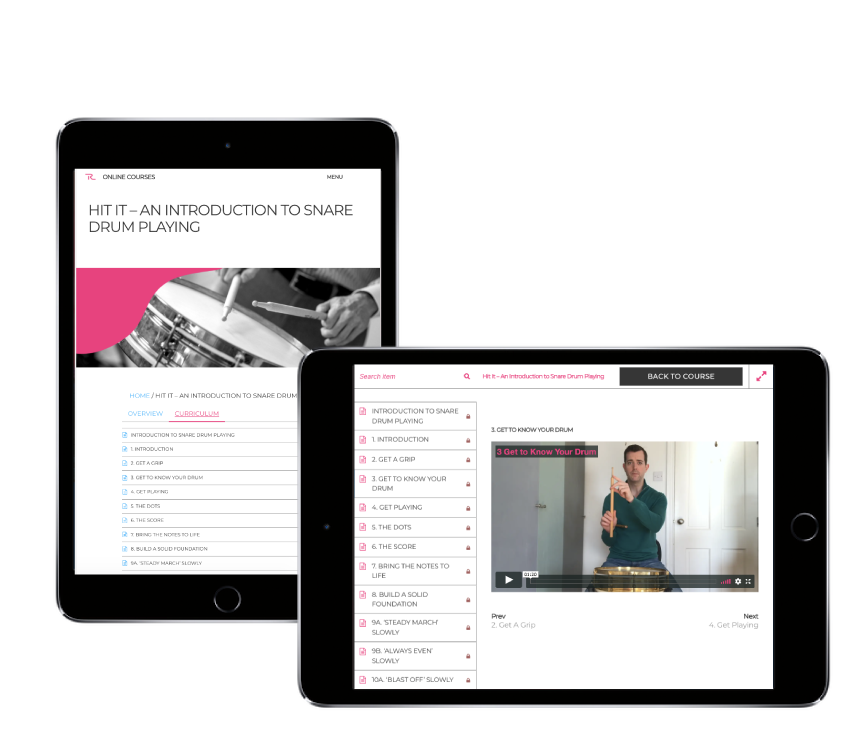
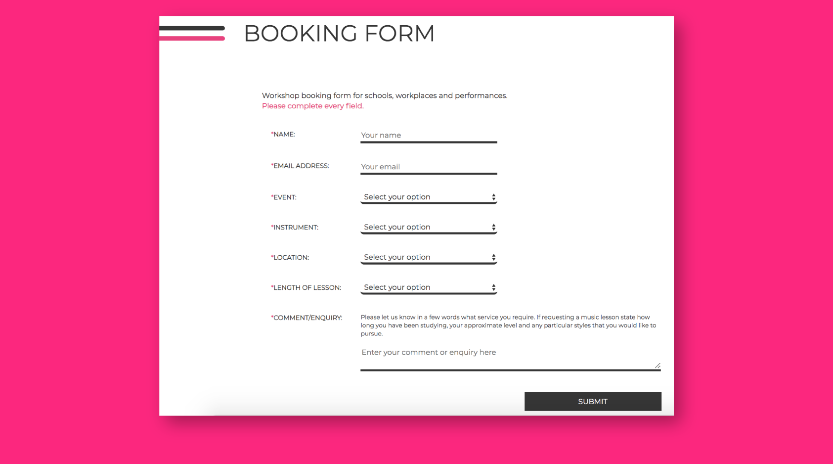
Soon, the website was to expand. The company CEO wanted to launch a series of online courses, which customers could buy access to. This required a payment system and a user interface setup, where customers could only access a particular course content once the payment had been made.
The aim was to make the content protected against sharing or downloads, so that it could only be accessed through RT Education website. Through their profile, users were not only enabled to access purchased courses, but also track their progress, access the billing information, and control their profile settings.