RETRO MOTO


DIGITAL CAMPAIGN

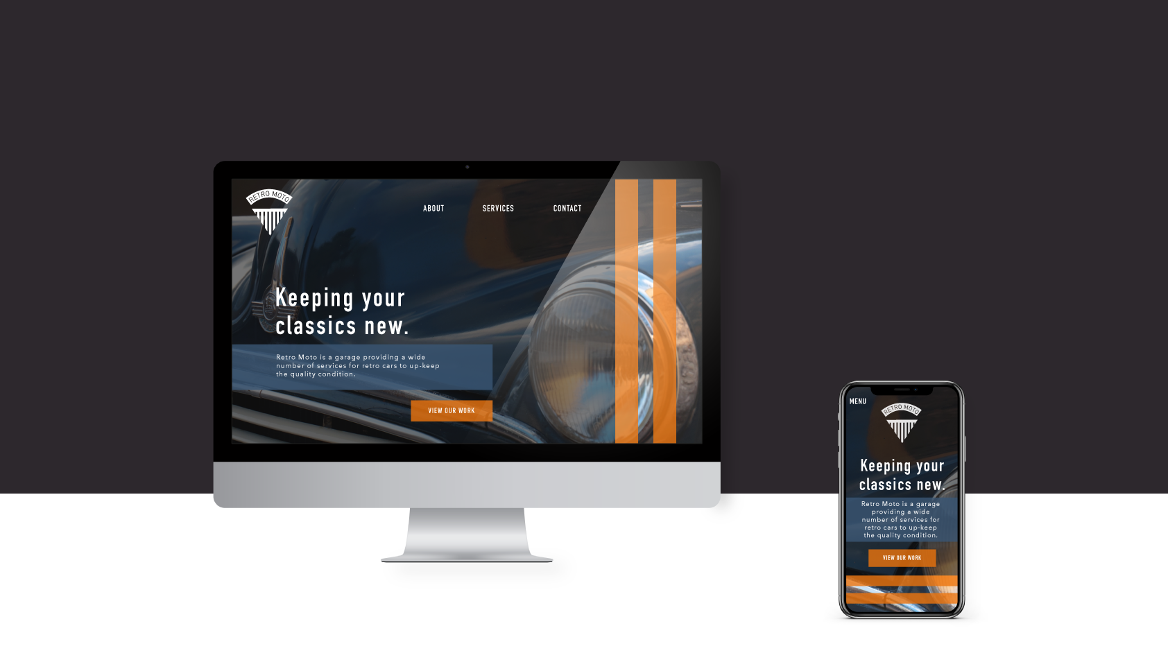
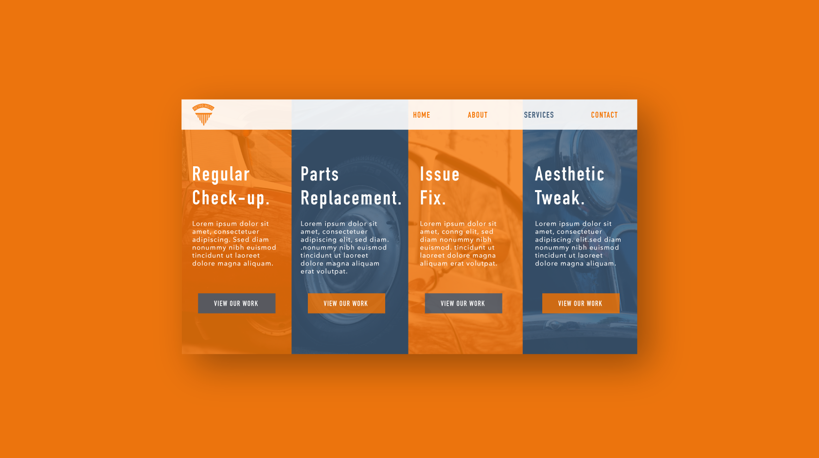
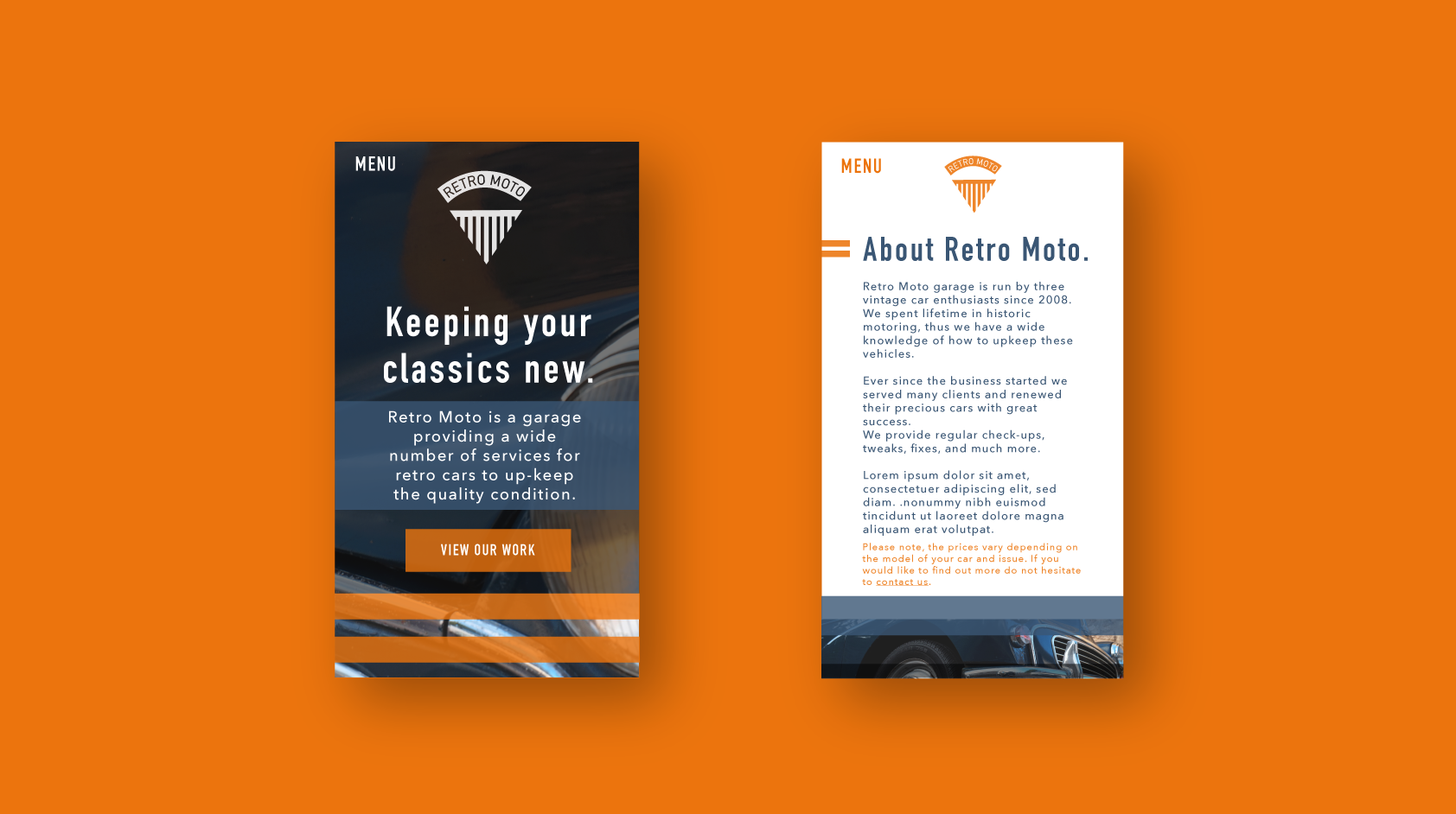
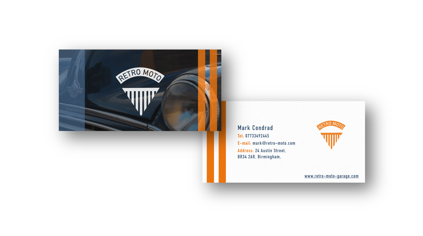
A vintage car garage already sounds stylish! The one thing missing from the business to shine was some 'visual flavours'. AimVisia happily provided what was needed; a logo along with a branded website, business cards, and a photo shoot. The aim was to create a brand identity that would reflect the passion for historic vehicles.
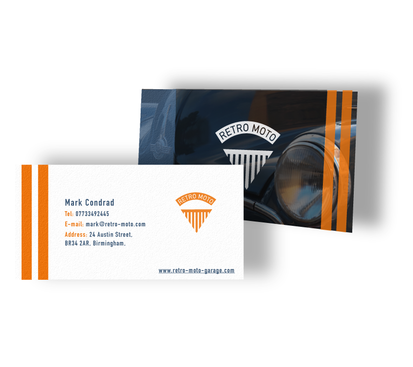
LOGO SHAPE

The design process was inspired by front-end covers of vintage cars. This is indeed where the vision for this design came from and so the logo shape was created.


COLOUR SCHEME

The colours were carefully picked, referring back to the style of the company, to reflect the vintage feel but with a modern twist. This complied well with the company motto "keeping your classics new".

PHOTO SHOOT

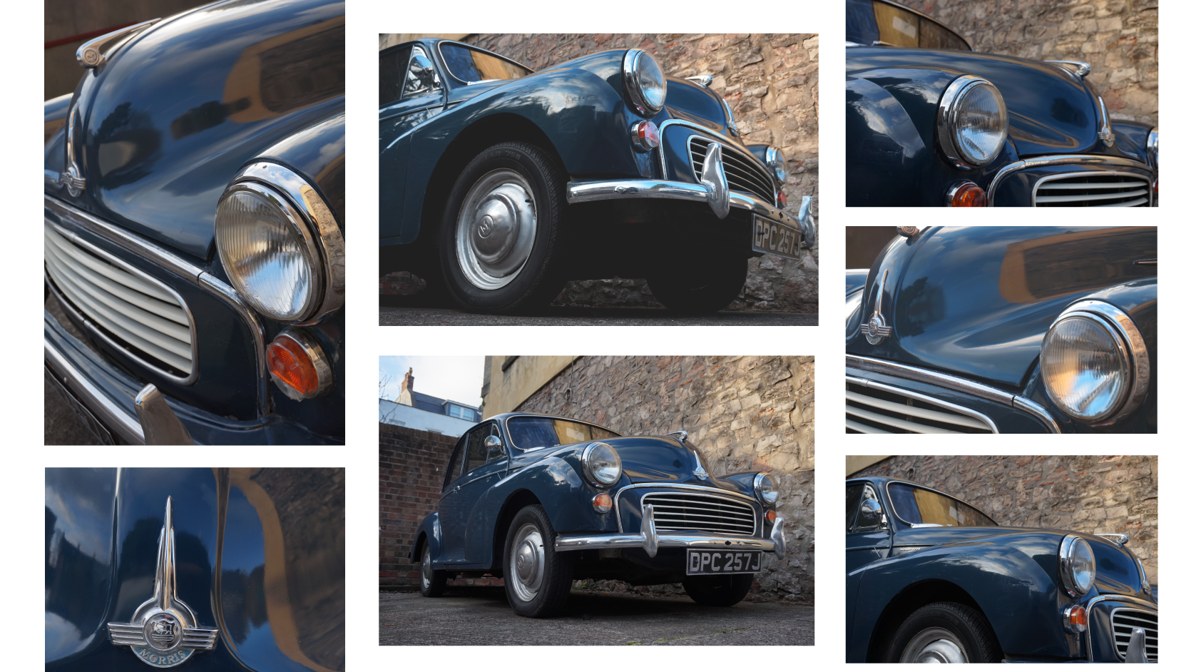
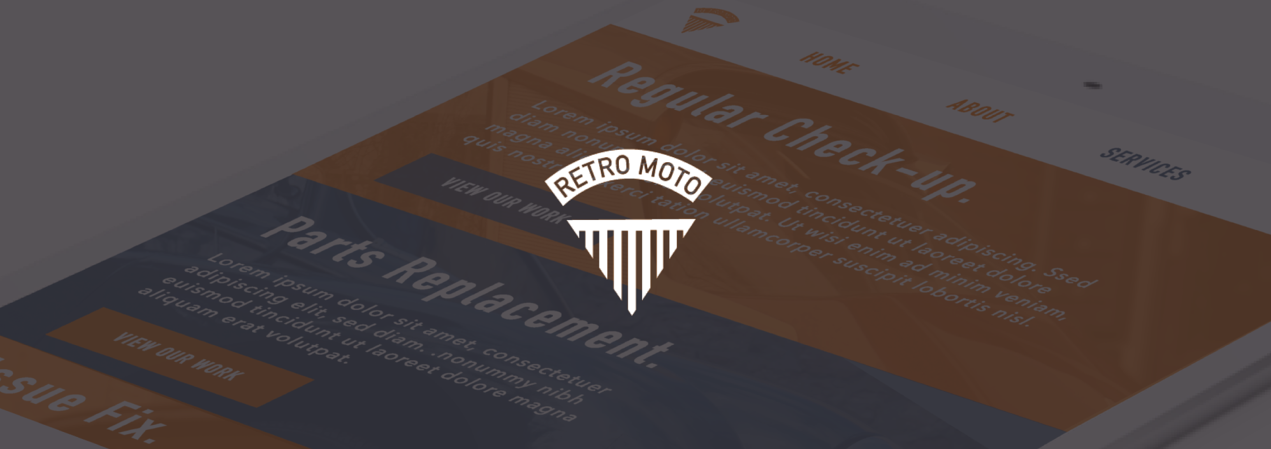
Given that Retro Moto was only at the very start of their journey, it was essential to create some real-life visual material for the business. When taking photos at the garage for the website content, it allowed us to explore the services they provide and understand the company better. This was very helpful when creating the brand identity for them. Photos focusing on different aspects of cars were displayed on the website to exhibit what type of services are offered.

IDENTITY DESIGN

As car fanatics, the company and their clients, with passion, care for their vehicles' well-being. They find pleasure in driving and only want to hit the road. For AimVisia, it was important to reflect such lifestyle in the design, so it was based on road lanes and speed. This can be noticed in the photographic banner designs, where there are blue and orange stripes. The website was divided into sections, where content was placed into a rectangular layout. The notable orange design inspired by road lanes can be found across the website and the business cards, creating a true Retro Moto brand.


RESPONSIVE WEBSITE DESIGN

Vintage or not, we live in an age where it is vital for a website to respond to different screen sizes with easy usability in check. The Retro Moto website was designed to be simple, clean, and well spaced out for convenient navigation and readability. This was to reach a wide range of audience, and it was especially important when considering the common Retro Moto users' age group.

Similar projects:


CONTACT


Fill in the form below to let us know about your enquiry.