THE PULSE
LOGO
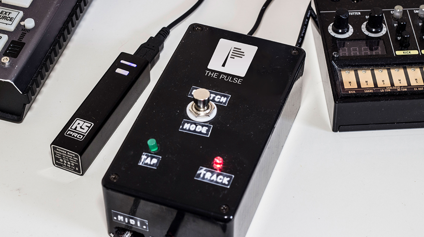
The Pulse was developed to help musicians get better and create music easier. It adjusts itself accordingly to the timing of the music performed by a player on an instrument. It was an exciting new piece of technology that needed AimVisia to help with 'visual flavours' to advertise it. The aim was for the visuals to portray what the product does.

IDEA PROCESS
There were different ideas presented to the product founder. One of the ideas was for the logo to showcase smooth sound frequencies that represented an easy instrument playing practice - the purpose of the product. Additionally, the font was designed to symbolise music notes. As compelling as this design was, it did not portray the representation of what the product actually does. After some difficult analysis, the idea inspired by a metronome was the final choice. The Pulse was based on this device and developed further with a modern and interactive twist, hence the final choice of the logo.
“Each design had at its core a clever visual reference to a key aspect of the product, which was really exciting to see and gave a real sense of cohesion.” - CEO of The Pulse.

What do they say?
“The design expertly captured the essence of the product, and gave the concept a solid brand identity that gave it much more credibility when being presented to others.”
CEO of The Pulse
