FVANNINI


LOGO

For an Information Technology (IT) consultancy, it is especially important to upkeep with the constantly developing trends in the world of technologies. Their out-of-date logo was no longer sufficient enough for the progressive business. The aim was to create a new modern logo with more symbolism, so AimVisia stepped in to add some 'visual flavours' that are now catching attention in the Netherlands and Italy.

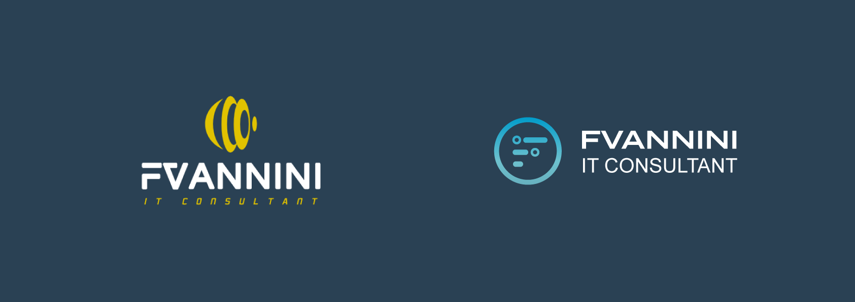
LOGO SHAPE

The old logo did not give away enough of the company's possibilities. They work with the most advanced technologies to provide IT solutions to their clients. This was an important aspect for us to highlight in the design. They needed a logo that would bring out more symbolism, in a modern style, and reflect what the tech company has to offer.

The new logo outlined computer circuits in its shape, the predominant component of the business. The vision for the way it was formed was inspired by the all-round technology services the company provides. The circuits were arranged into the letter ‘F’. Now, the new techy logo is symbolising how FVANNINI will connect IT pieces together for you.


COLOUR SCHEME

The shade of the previous logo colour was not very lively, making the company look unexciting. We decided to create a colour palette that is more compelling, in shades associated with the modern technology the most - blue. The two matt shades were carefully chosen and combined into a subtle gradient that defined the final look.

What do they say?


“AimVisia designed my logo and delivered a product I'm proud to show and use for my business. I was definitely pleased with the service provided.”

CEO of FVANNINI

Similar projects:


CONTACT


Fill in the form below to let us know about your enquiry.