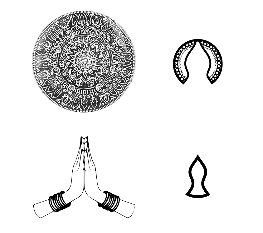
NAMASTE INDIA


LOGO

A new restaurant that brings the taste and culture from the far East, and does so in style, needed a logo that would represent that. When asked, in no doubt AimVisia wanted to add some 'visual flavours' to the pot. The aim was to compel bypassers to come in and have a taste.

LOGO SHAPE

The stylish Indian restaurant, offering quality food, needed a logo that would invite even the most picky eaters. The business offers more than just good food. The entire culture is served with an ordered dish. The design was put together to draw attention to the central outline that reflects the Namaste symbolism and invite bypassers to walk through the restaurant doors.
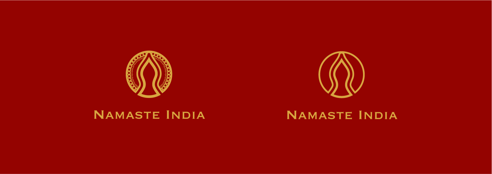

COLOUR SCHEME

The iconic colours for Indian cuisine and culture are red and gold. We, of course, did not want to take this away, so we worked on representing these colours in a new manner and picked out appropriate modern matt shades.

IDEA PROCESS

Great food and great culture. The two facets had to be portrayed in the logo. After research, we began to sketch out ideas of how these could be shown. The final result ended up being a combination of a simplified cultural plate and hands put together into the Namaste greeting.

The plate-inspired part of the logo was to symbolise food, hunger, and taste, whereas Namaste was in reference to the welcoming warmth, hospitality, and the business name. Both symbols are filled with Indian culture, resulting in a logo that invites you to come through the Namaste India doors. The minimalistic version of this idea was without the plate pattern, which took away from the cultural aspect of the identity. With this in mind, the more detailed logo was chosen to represent the business in the end.

Similar projects:


CONTACT


Fill in the form below to let us know about your enquiry.