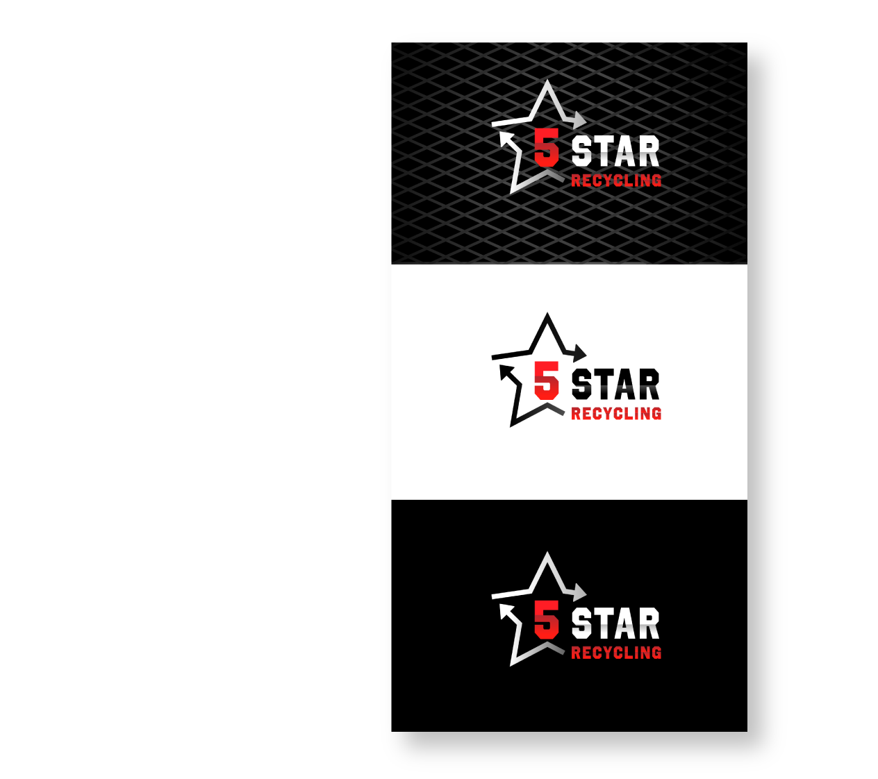
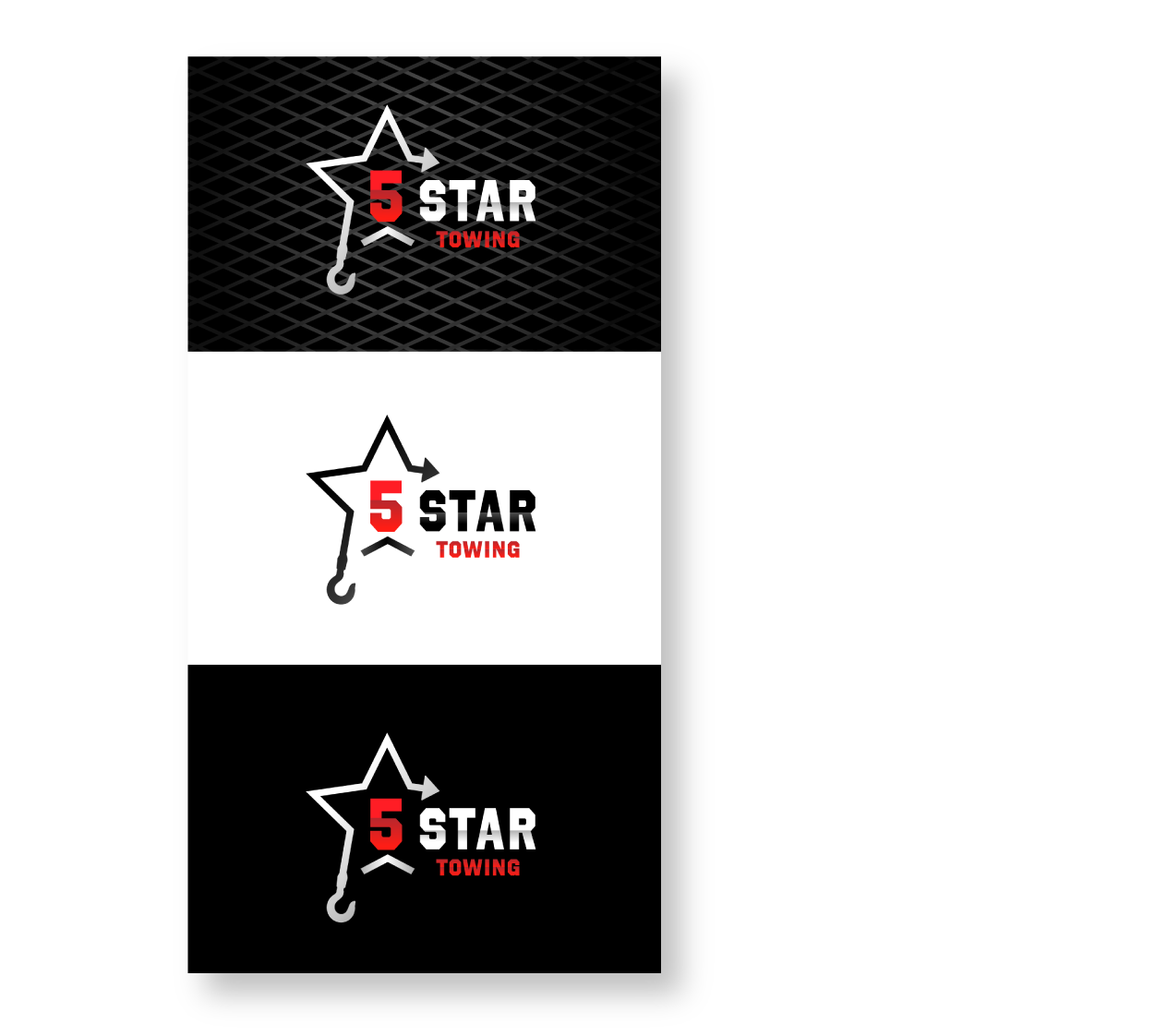
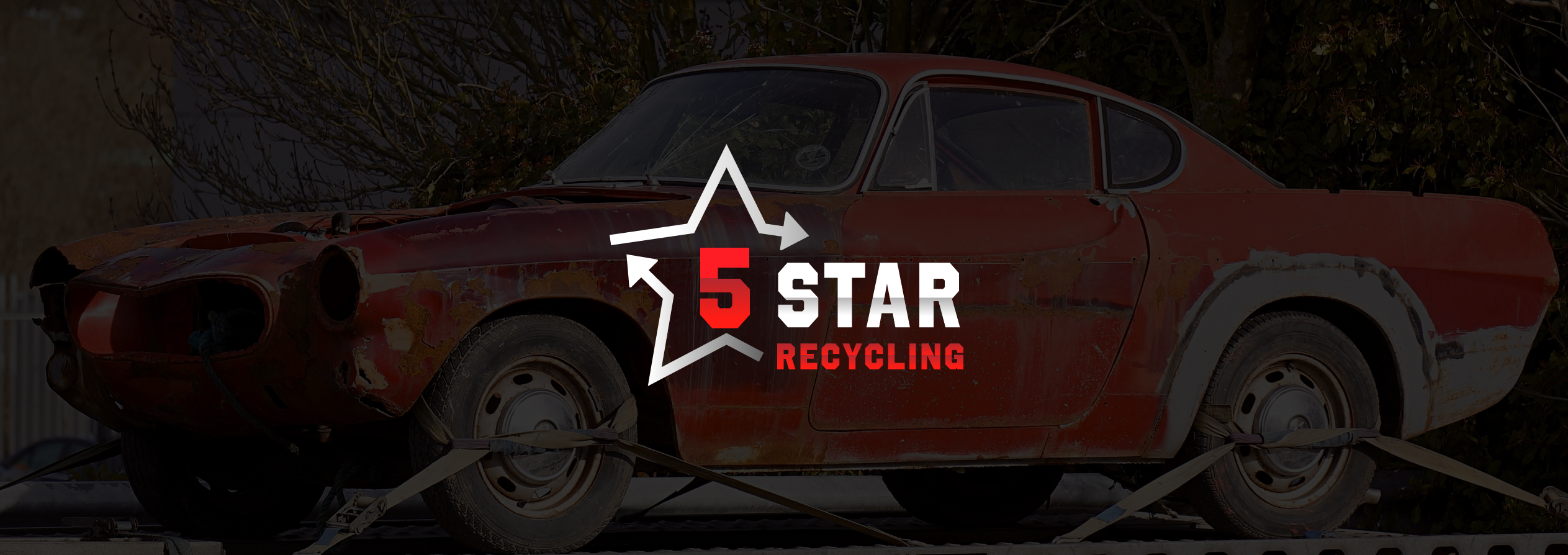
LOGO SHAPE
There were two logos to be designed; one for the towing business and one for the recycling business. The logo was approached by bringing out the star into a graphical element and combining it with text. To highlight the differences between the two businesses, a hook graphic was used for the towing logo, and arrows for the recycling logo. The sharp edges and the chunky font chosen were based on the automotive theme, which also inspired the gradient. In addition, the arrow shapes created a sense of moving forwards - dealing with your vehicles for you.
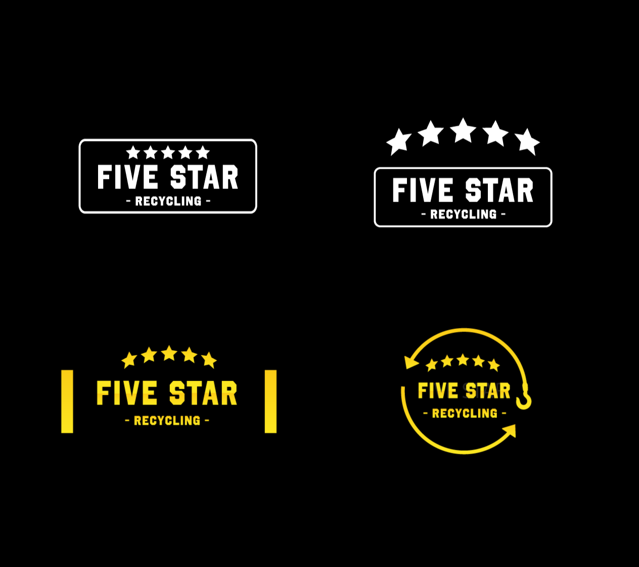
COLOUR SCHEME
The company founder's heart was set on red, so the colour scheme and gradient followed that direction. The red creates a strong contrast with black and is very attention seeking, so this shade was used to differentiate the 'towing' and 'recycling' businesses in the logos and make '5' stand out.