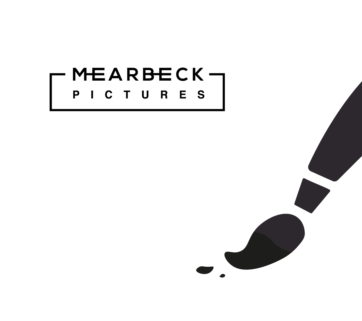
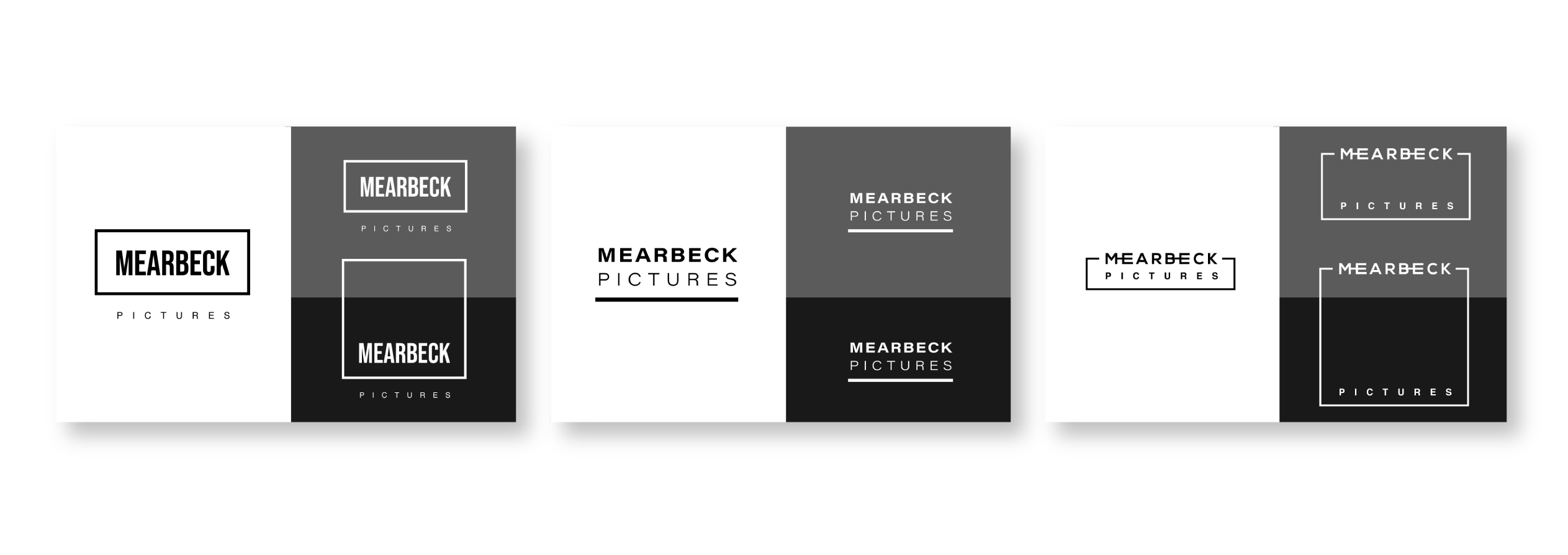
MEARBECK PICTURES


LOGO

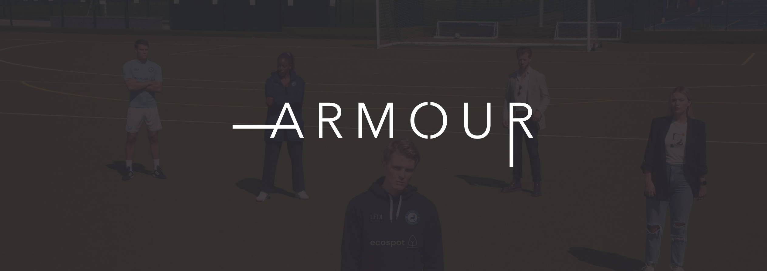
The motion pictures company, with an upcoming TV series underway, needed 'visual flavours' to present themselves in a modern and impactful way. AimVisia helped the directors to reach the investors by presenting the company and their work (Armour) in style.

LOGO SHAPE

The shape was inspired by the big screen, the rectangular outline and font symbolise this. The directors liked how the rectangular shape was manipulated to adjust the appearance of the logo; from standard screen (16:9) to wide and narrow (widescreen) and square (1:1), representing the different aspect ratios for big screens. The main logo ended up being the narrow rectangle, but with the two additional variations for other use.


There were three logo concepts presented, with the final one chosen to represent the company.

Similar projects:


CONTACT


Fill in the form below to let us know about your enquiry.