INTERSECTION


DIGITAL ASSETS

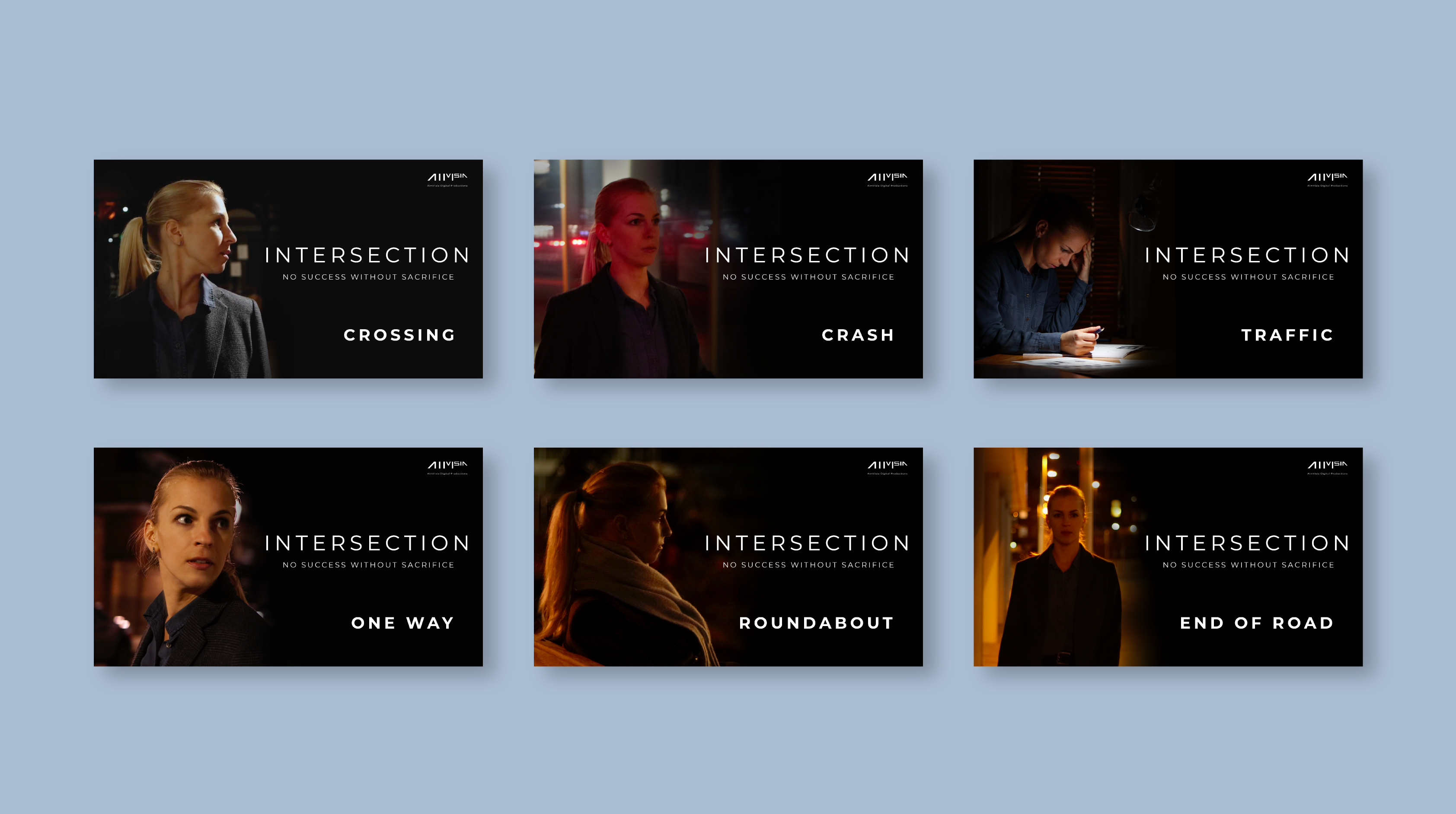
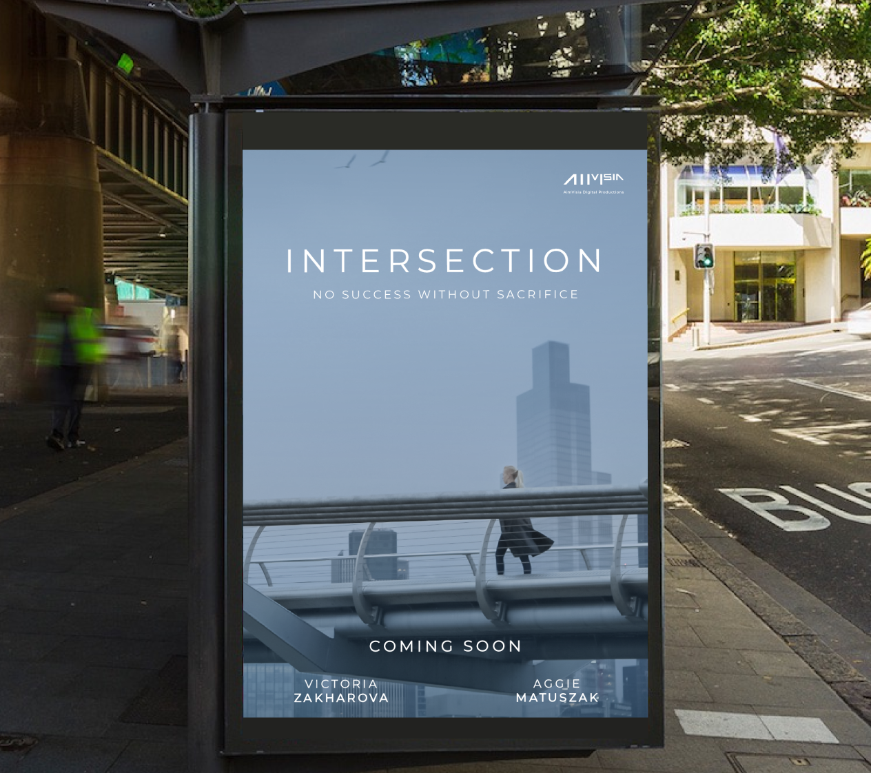
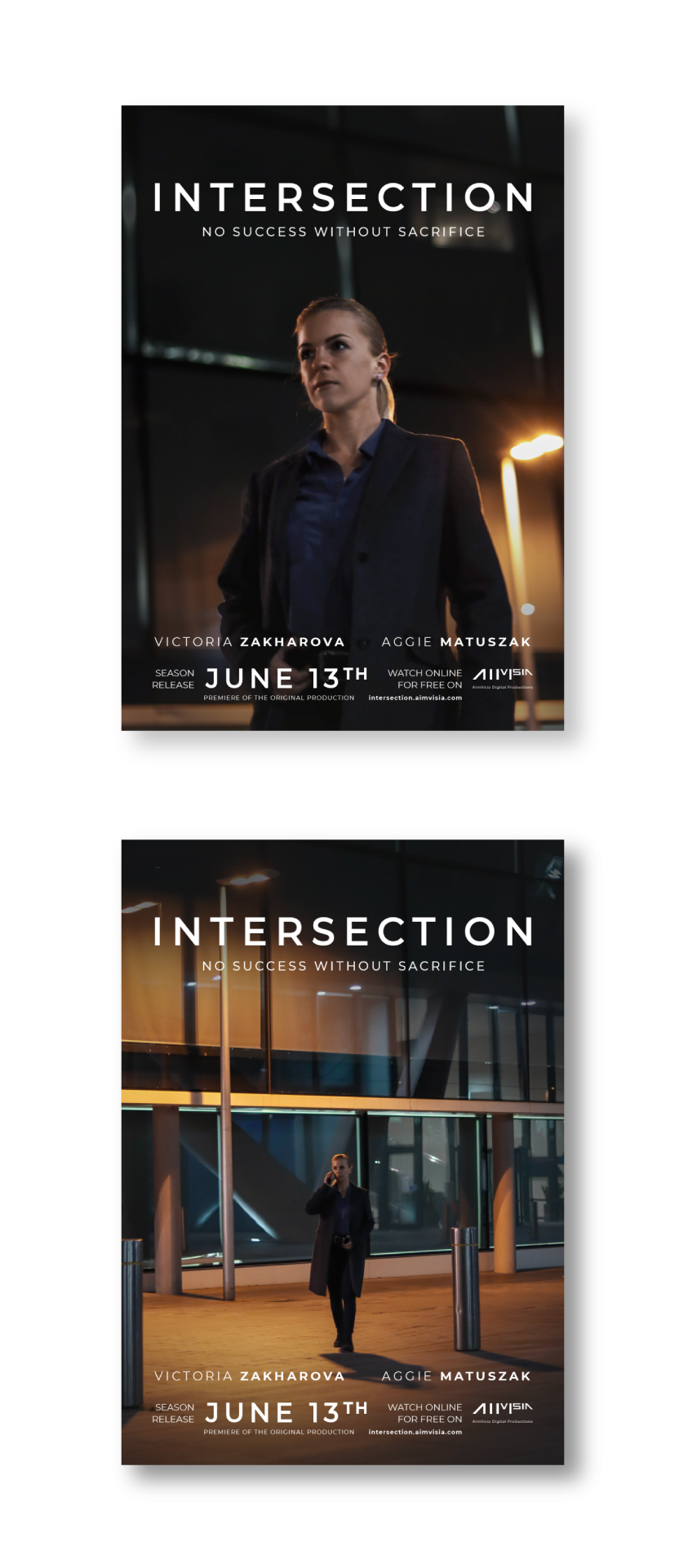
The 2021 web drama series, Intersection, had to have a substantial online presence and notable 'visual flavours' to present their work and reach international audiences. During the filming process, the marketing design assets accompanied the production. We also made a significant difference to post-production, by creating six coherent episodes for season one.

PRODUCTION

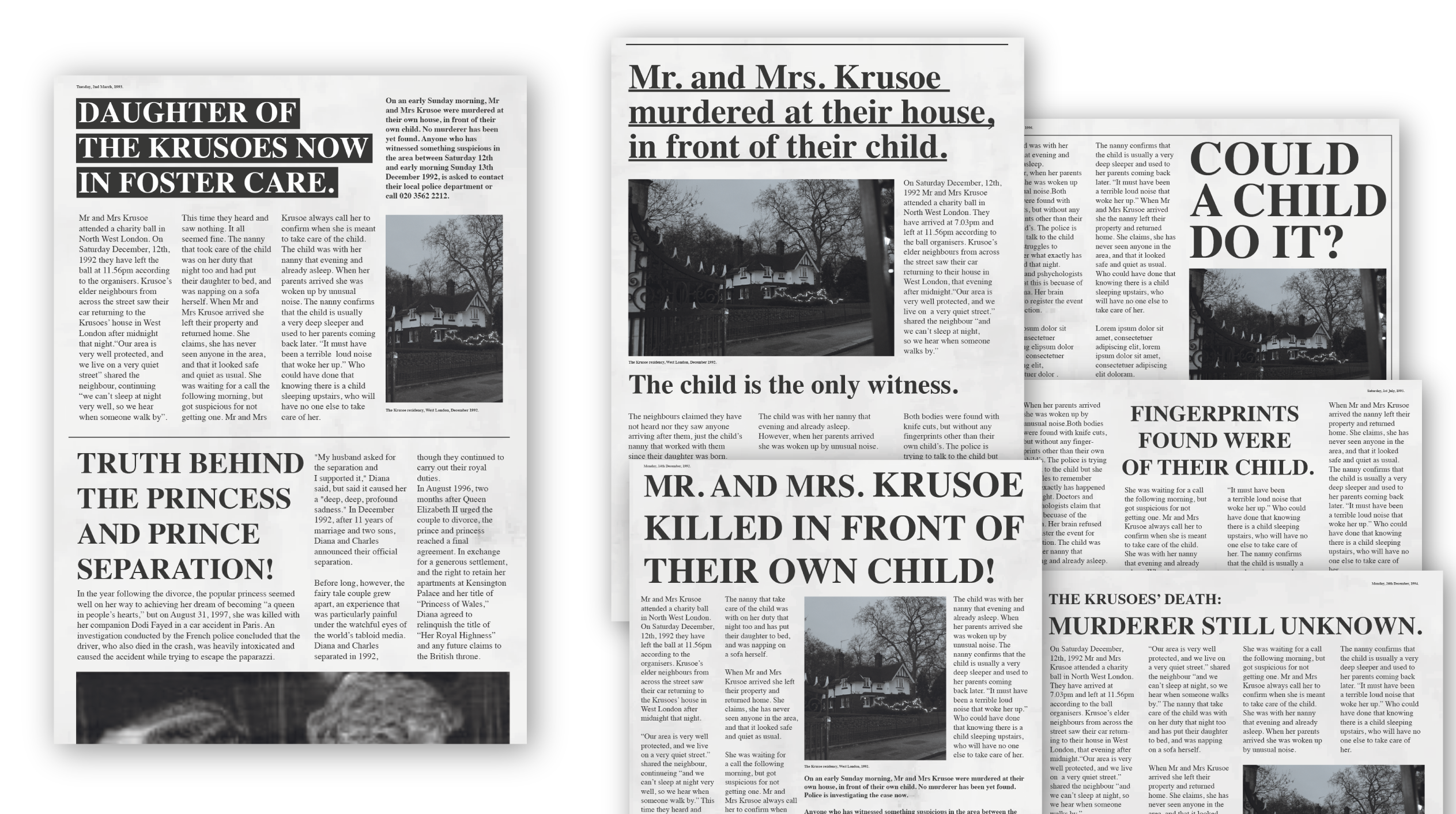
After the series was written and pre-production was complete, the following assets needed designing for a successful production to begin; newspaper articles, police reports, interrogation, fingerprints sheet and other offence-recording documents, and an online blog post.


POST-PRODUCTION

Next, once the series was filmed, AimVisia also took care of the post-production aspects; editing and retouching the footage (photos and videos), cutting the episodes, colour grading, adding audio, creating intros, etc.

The entire production, from a blank page to the final cut, was created by AimVisia.

Intros

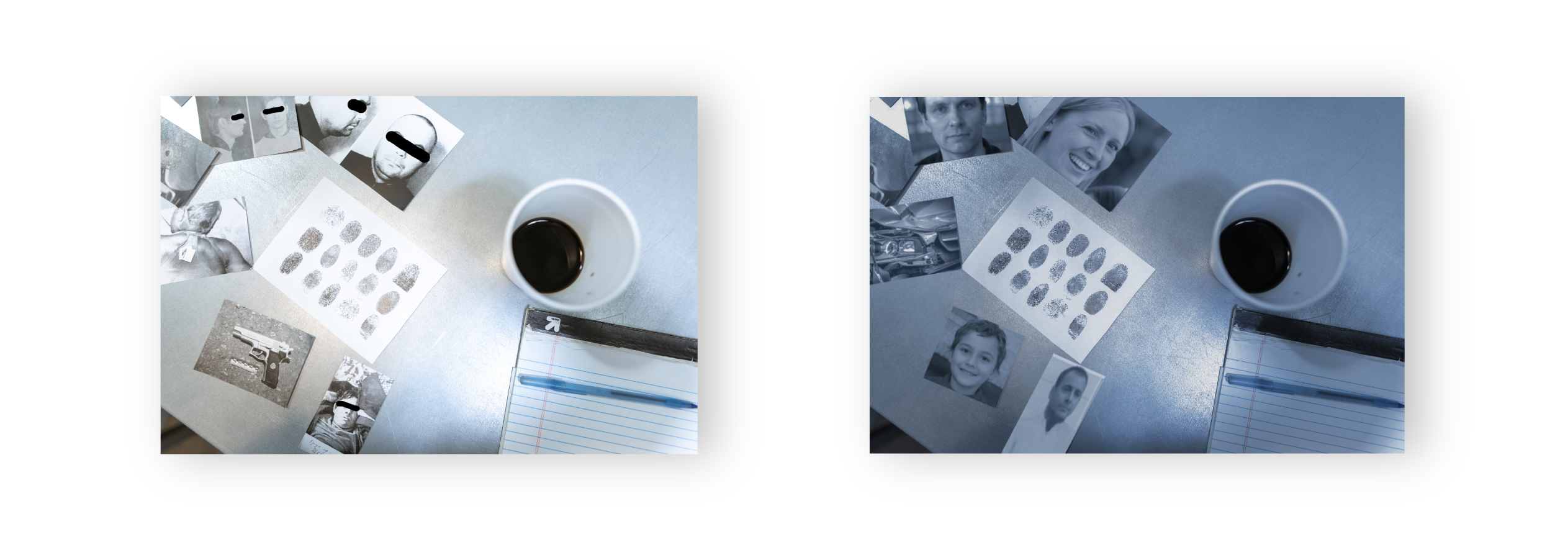
Expanding on 'visual flavours, the below snippet designed for the intro was altered accordingly for each episode. The photos on either side of the roundabout were changed to relate to the storyline in a particular episode.

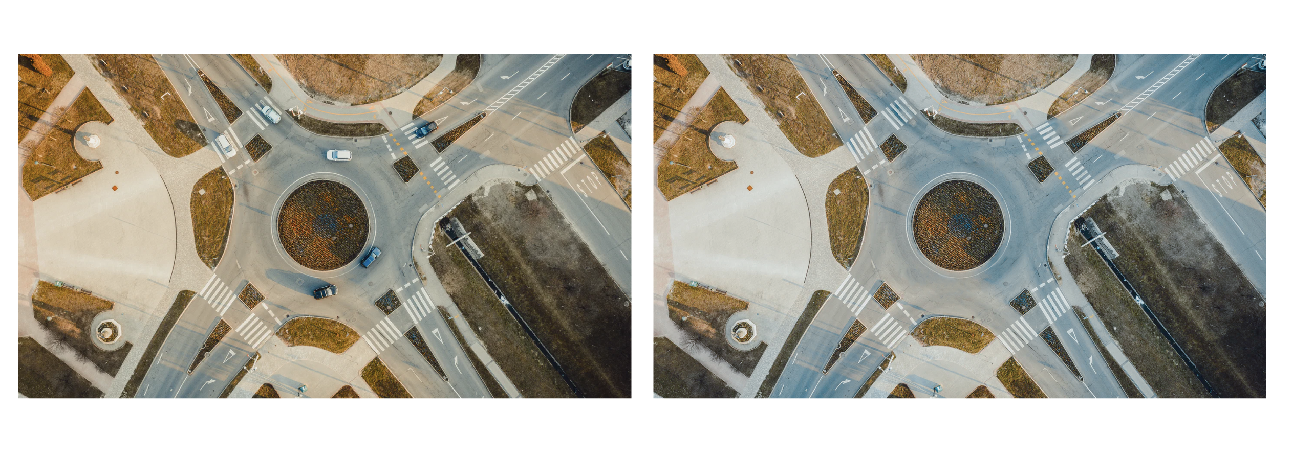
before and after

Any footage needs retouching sometimes. AimVisia took care of the editing, too.
SOCIAL MEDIA GRAPHICS

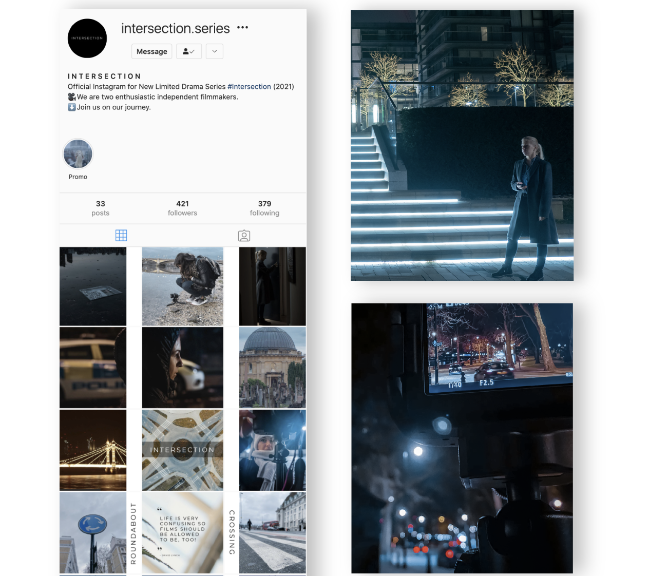
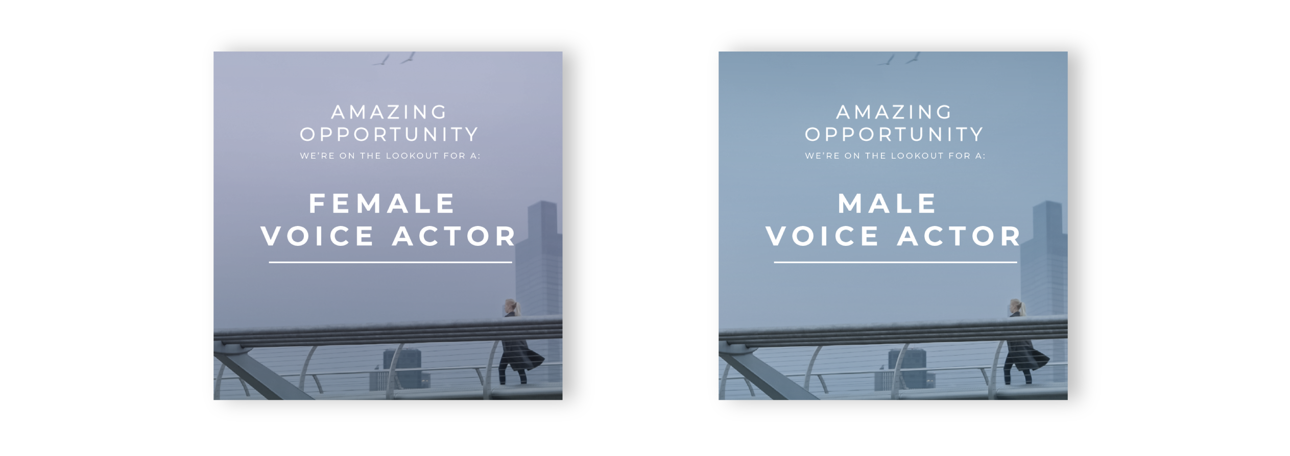
To grow some attention around the series before the release date, Intersection went on social media to display what was coming and reveal some behind the scenes. The episodes are filled with road references, thus the look for social media was carefully designed accordingly. The layout of the footage composed two continuous vertical white lines when scrolling through the profile. This is to symbolise road stripe markings, resulting in a clean consistent look.


RESPONSIVE WEBSITE DESIGN

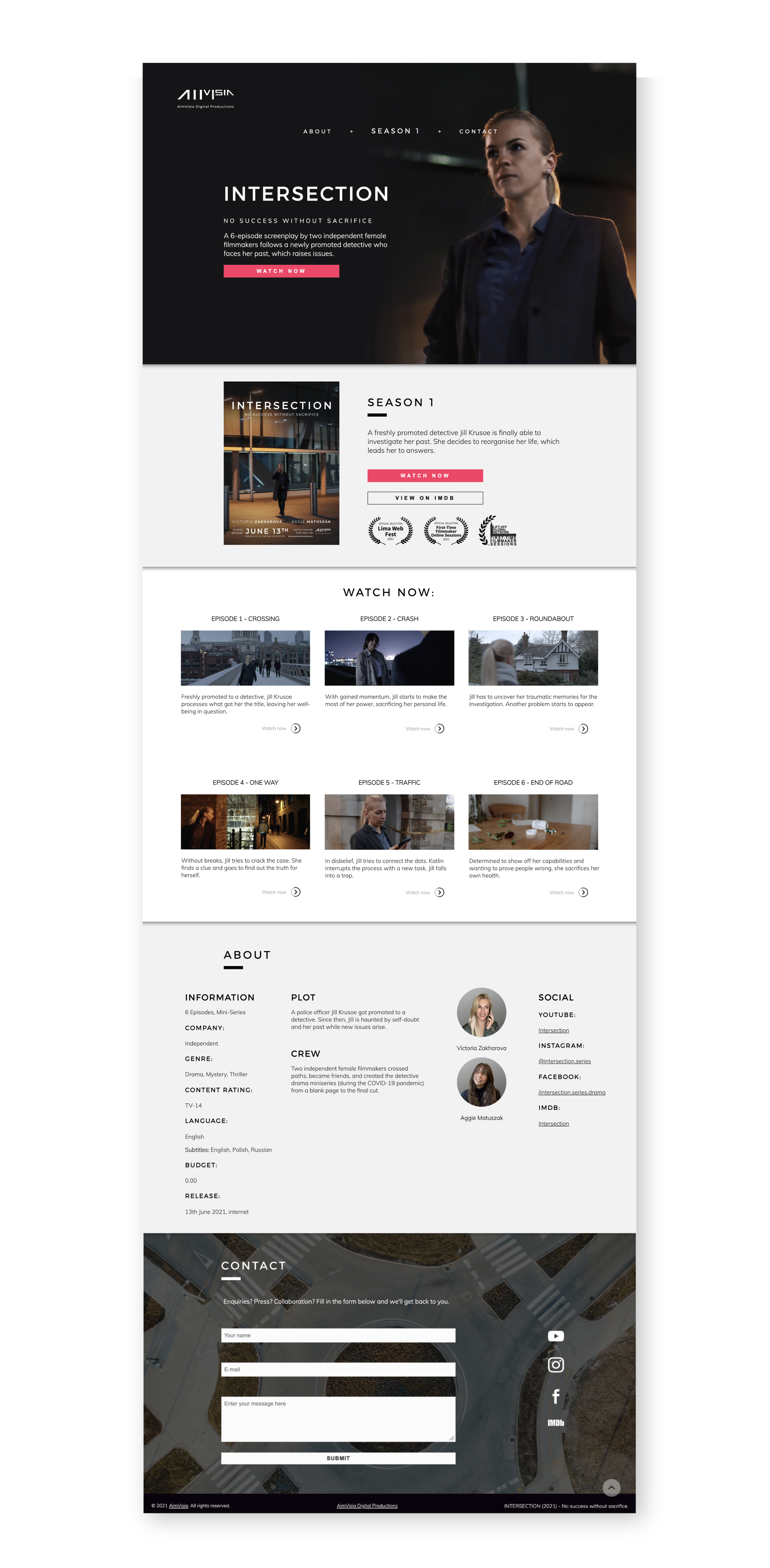
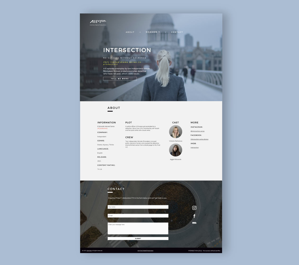
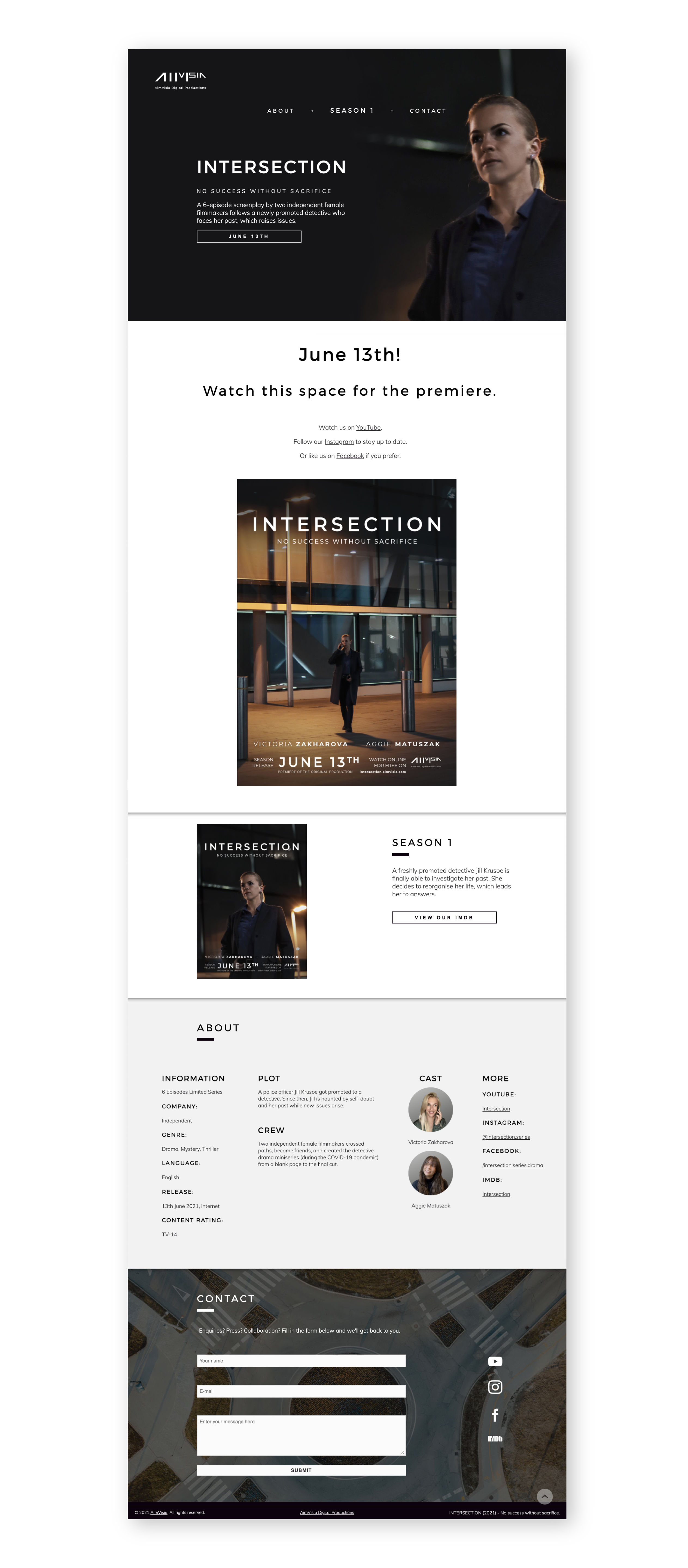
A website needed designing for the episodes to be streamed and more information about the show to be displayed. The website was constantly updated, and changed its looks accordingly to the phase of the production. During filming, the website was styled in an episodes' preview style. For the premiere, the website was altered to reflect the official season branding of the series. Though the look has changed, the overall feel of the brand stayed in check.

Similar projects:


CONTACT


Fill in the form below to let us know about your enquiry.