DECANTILLON FILMS
DIGITAL ASSETS
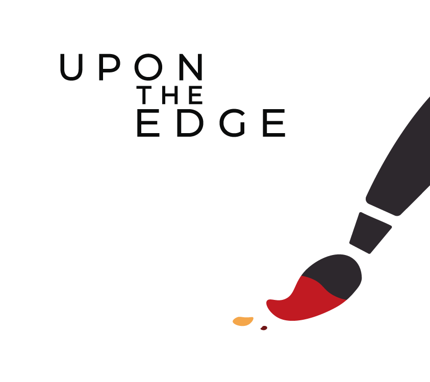
DeCantillon Films already has a few films on their account. With their new Upon The Edge feature they wanted to reach even higher, so they asked for our input on the 'visual flavours'. We created branding and assets for the film, and improved the company visuals too.

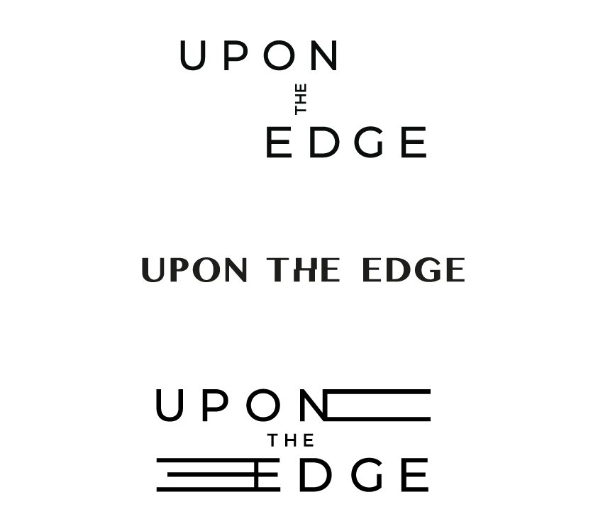
IDENT
During post-production, DeCantillon Films changed their logo and needed an ident. AimVisia applied motion to the new identity in a slow and progressive style but with an impactful finish. The directors liked the progressive build up as it matches the 'rise together' ethos of the company.
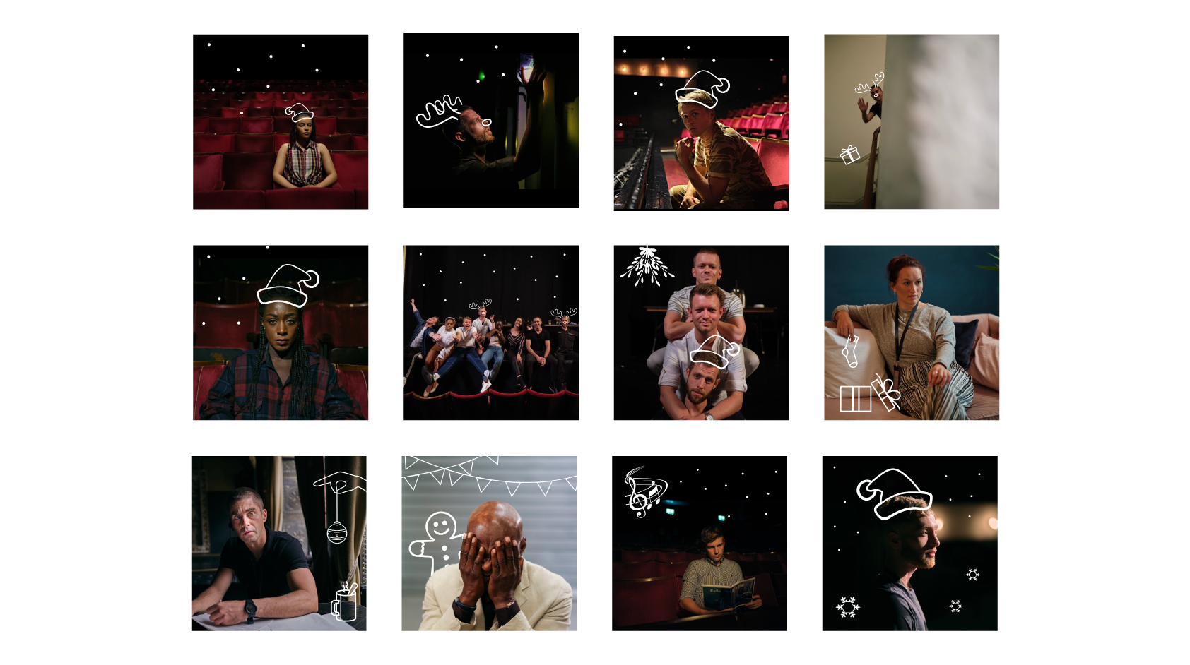
SOCIAL MEDIA GRAPHICS
While the film was in post-production, Christmas was approaching and their social media needed some attention. We created an advent calendar for the posts to introduce the crew in the following way.
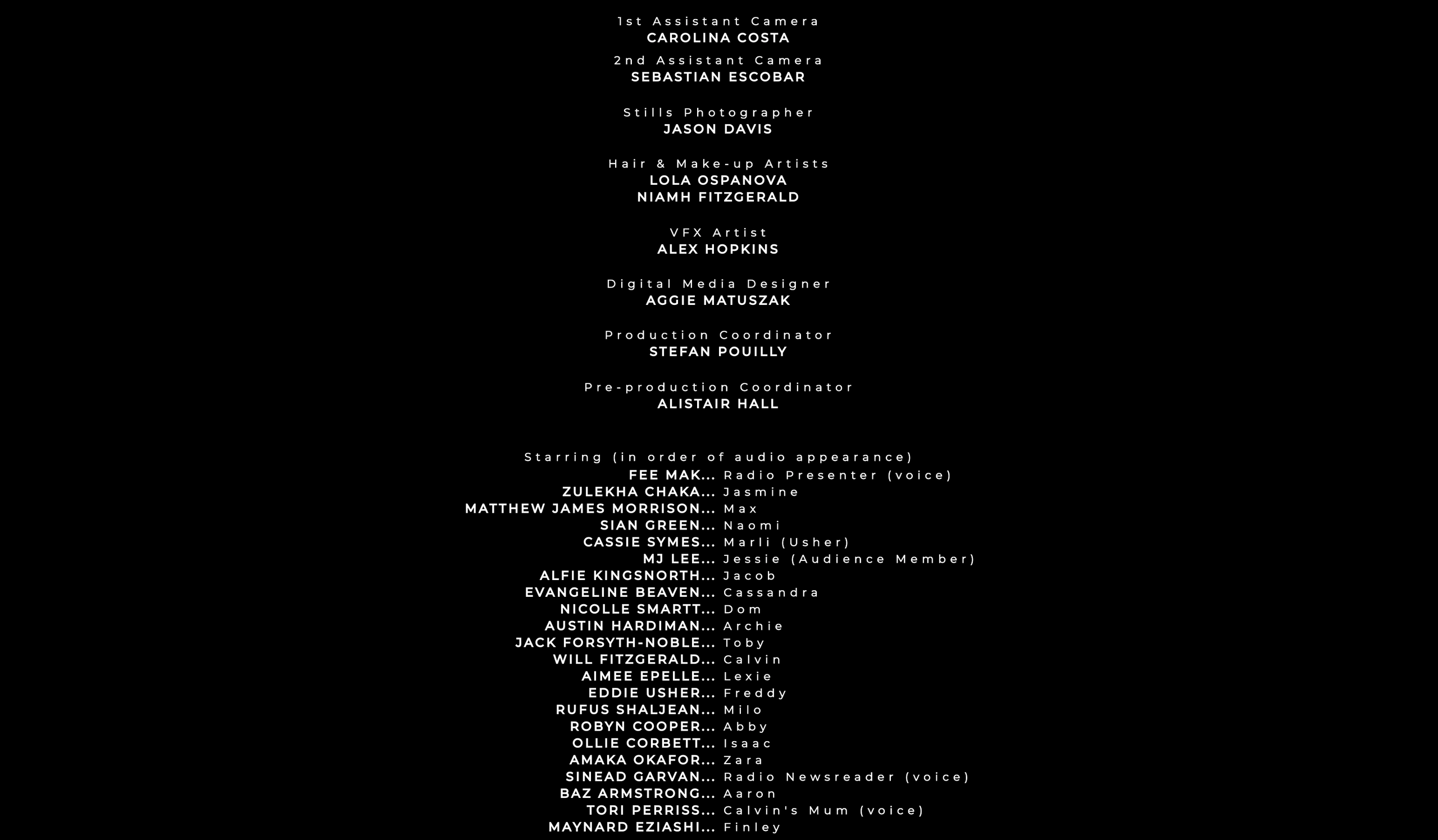
CREDITS DESIGN
AimVisia also took care of the typography visuals in the film and designed the titles and credits for the feature.
What do they say?
“It's been an absolute pleasre working with AimVisia.
We know we can rely on the work being delivered precisely.”
CEO of DeCantillon Films