JELACO
WEB DESIGN
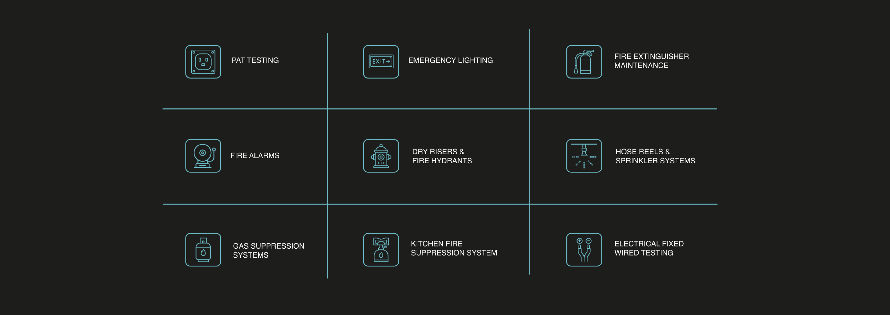
Jelaco is a small company but the work they complete is of a great substance - protecting people and large scale properties. The business is providing electrical and fire safety compliance, and to be recognised they found themselves in need of a website. We helped to create 'visual flavours' for them to validate their status. The work on this project was done for Ronin Marketing.


RESPONSIVE WEBSITE DESIGN
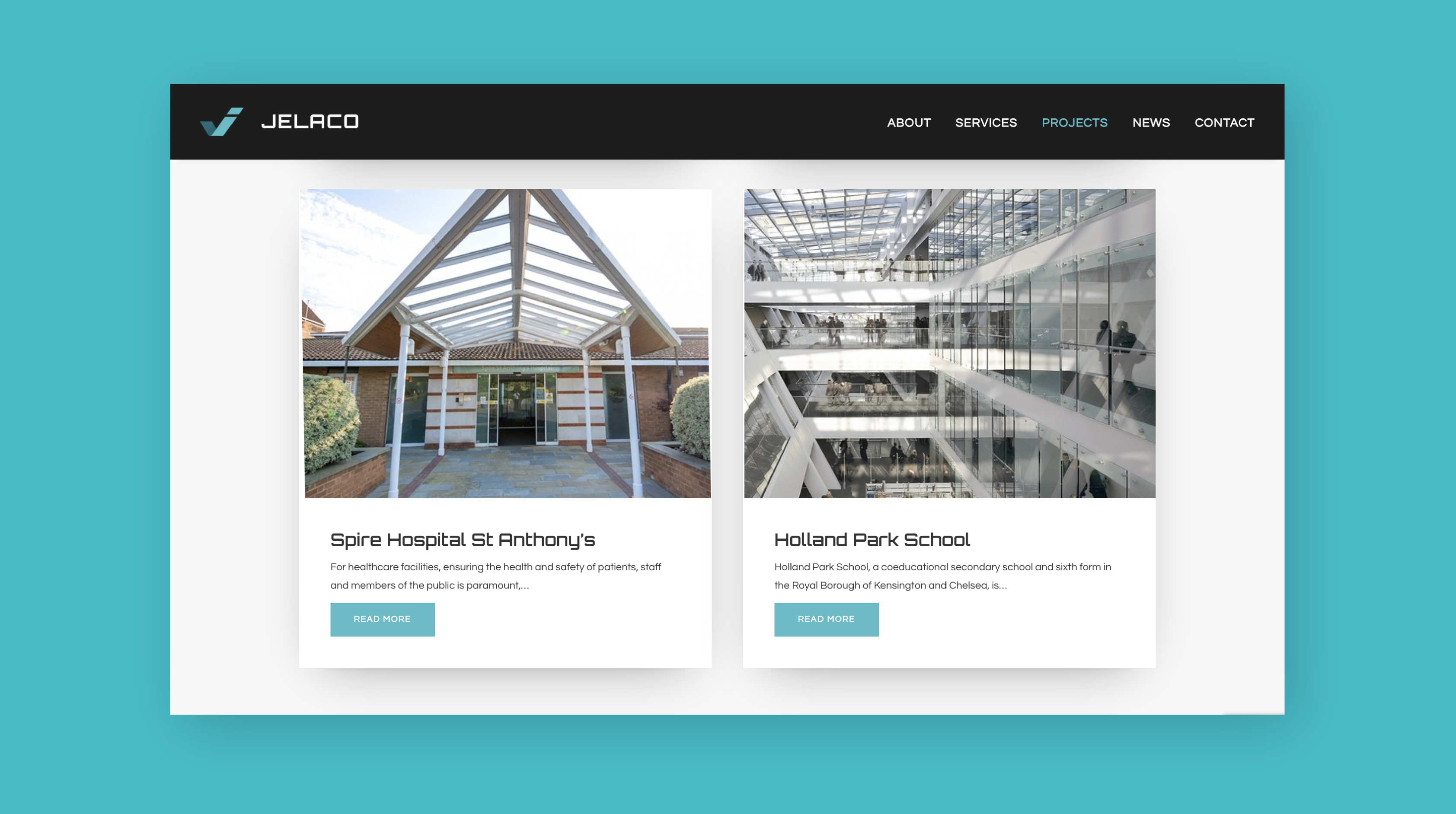
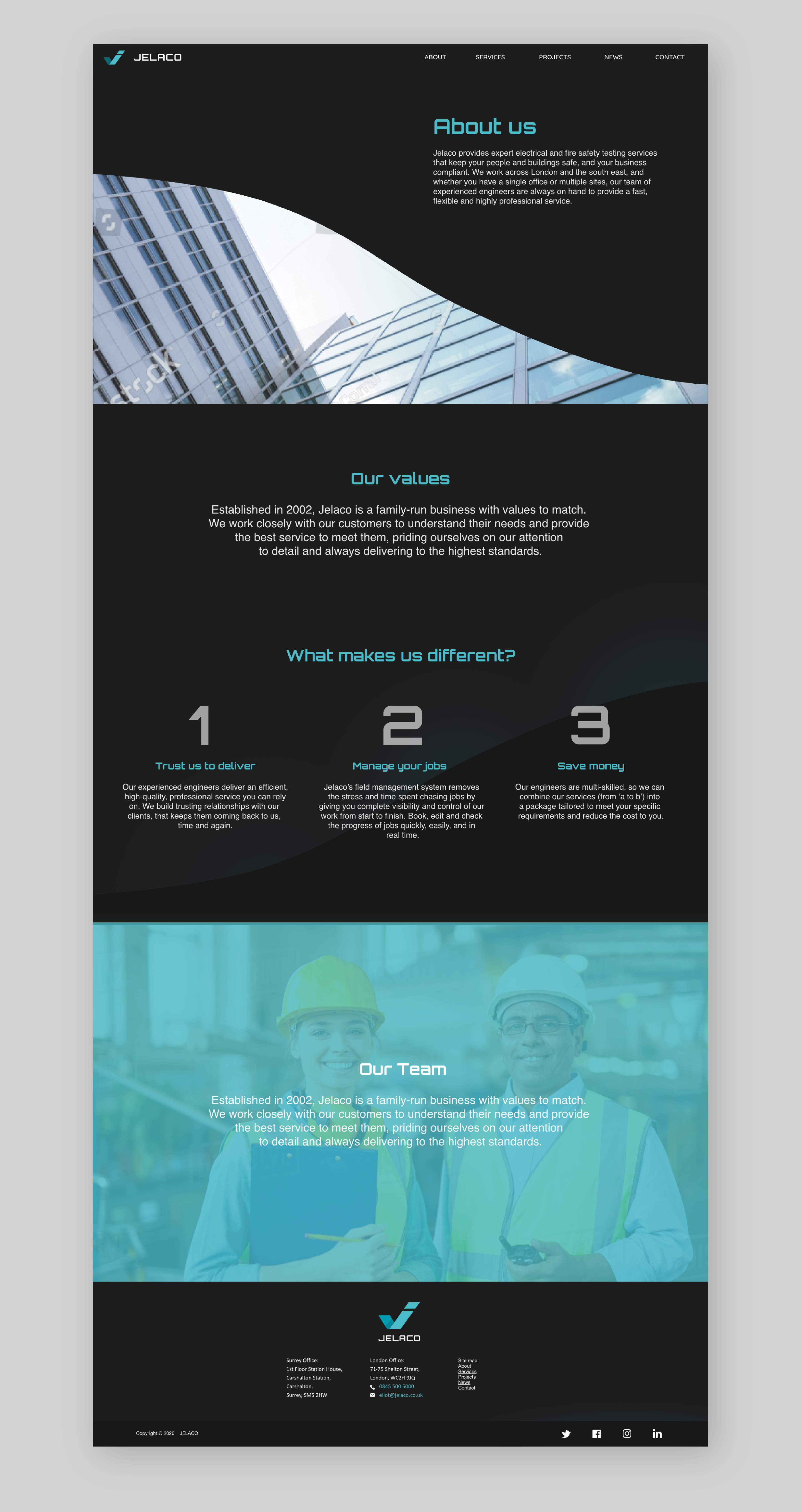
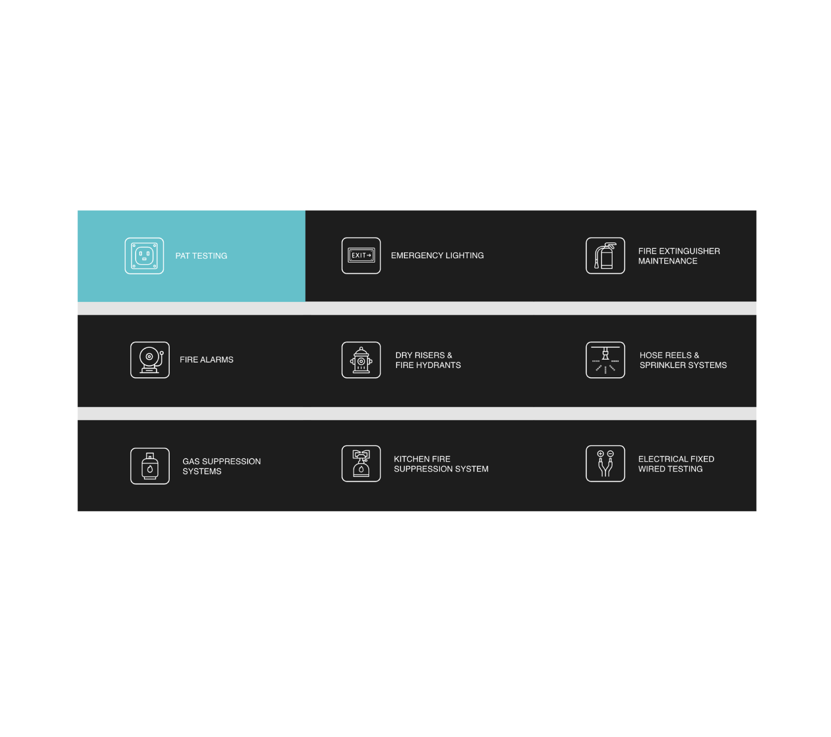
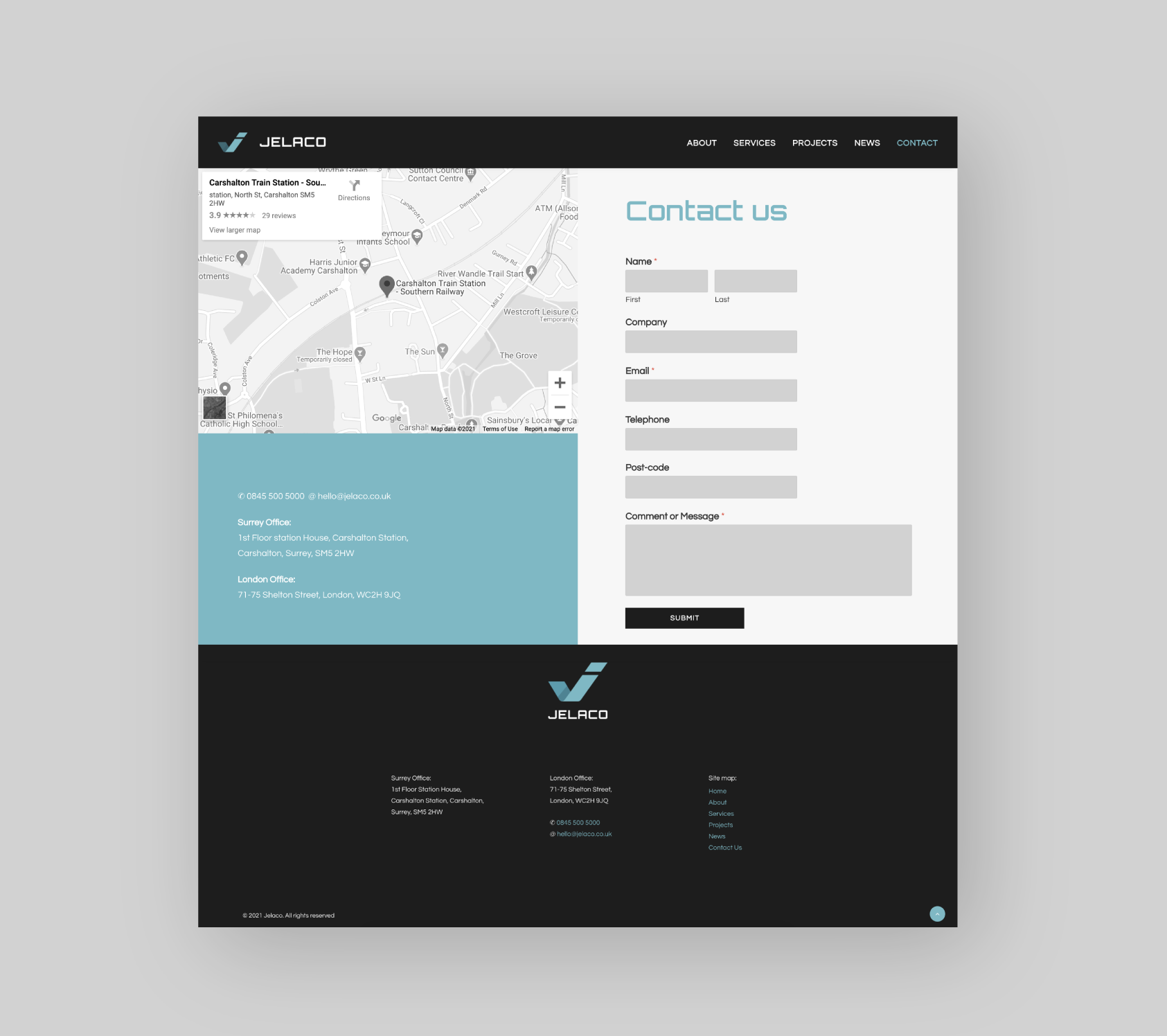
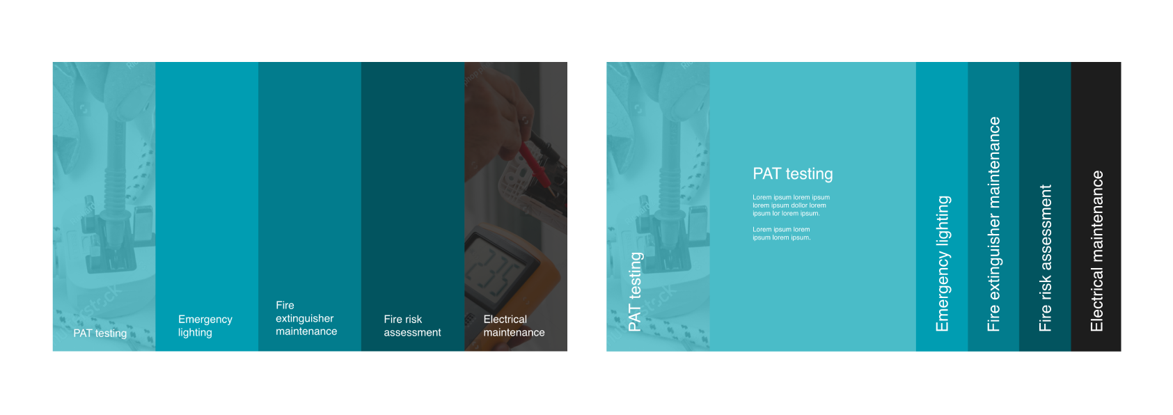
The website was to contain 6 pages with information about the company, their services, and also a blog to educate and stress the importance of electrical security in a workplace. Each page was implemented with a sports car design style, creating a unique Jelaco branding. The way the sections were laid out on the pages added a seamless flow to the viewing experience, and subtle animating components throughout created a dynamic outcome for the website.
