COMPUTERSHARE
BRAND ASSETS
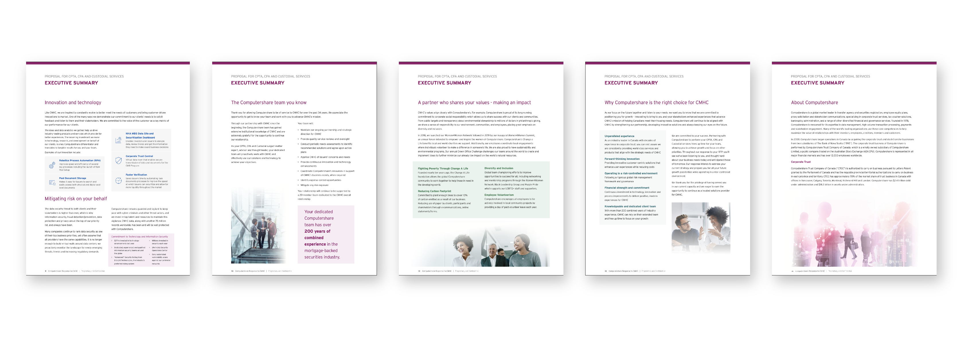
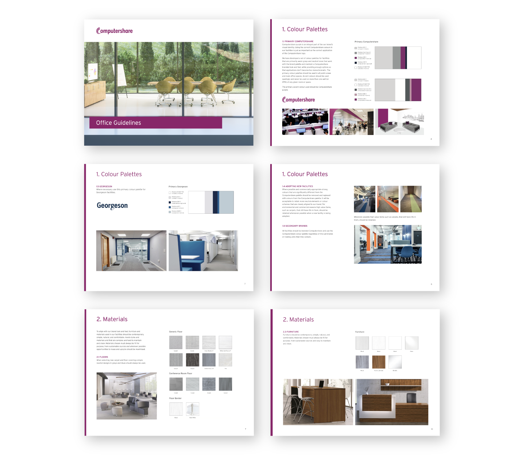
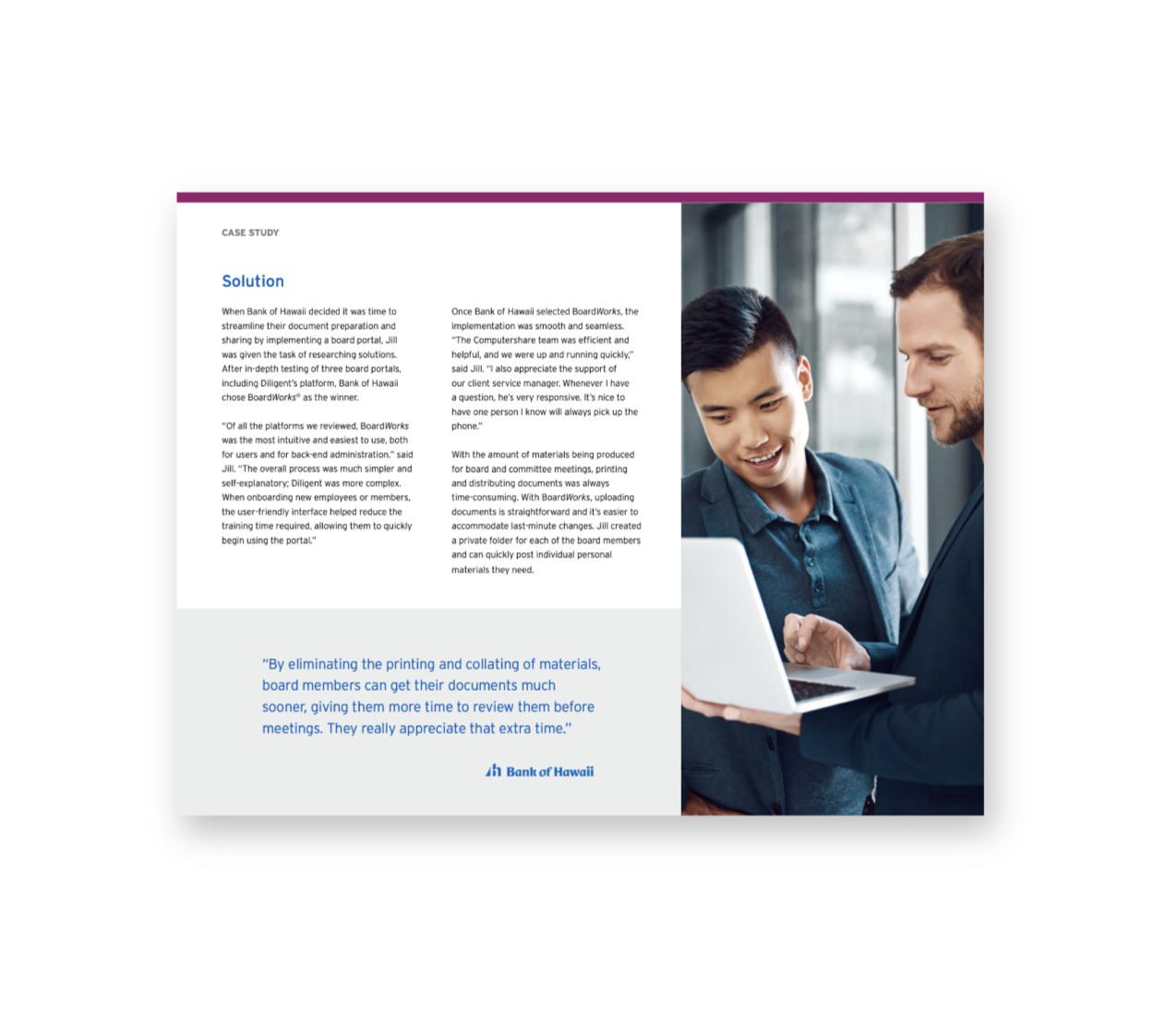
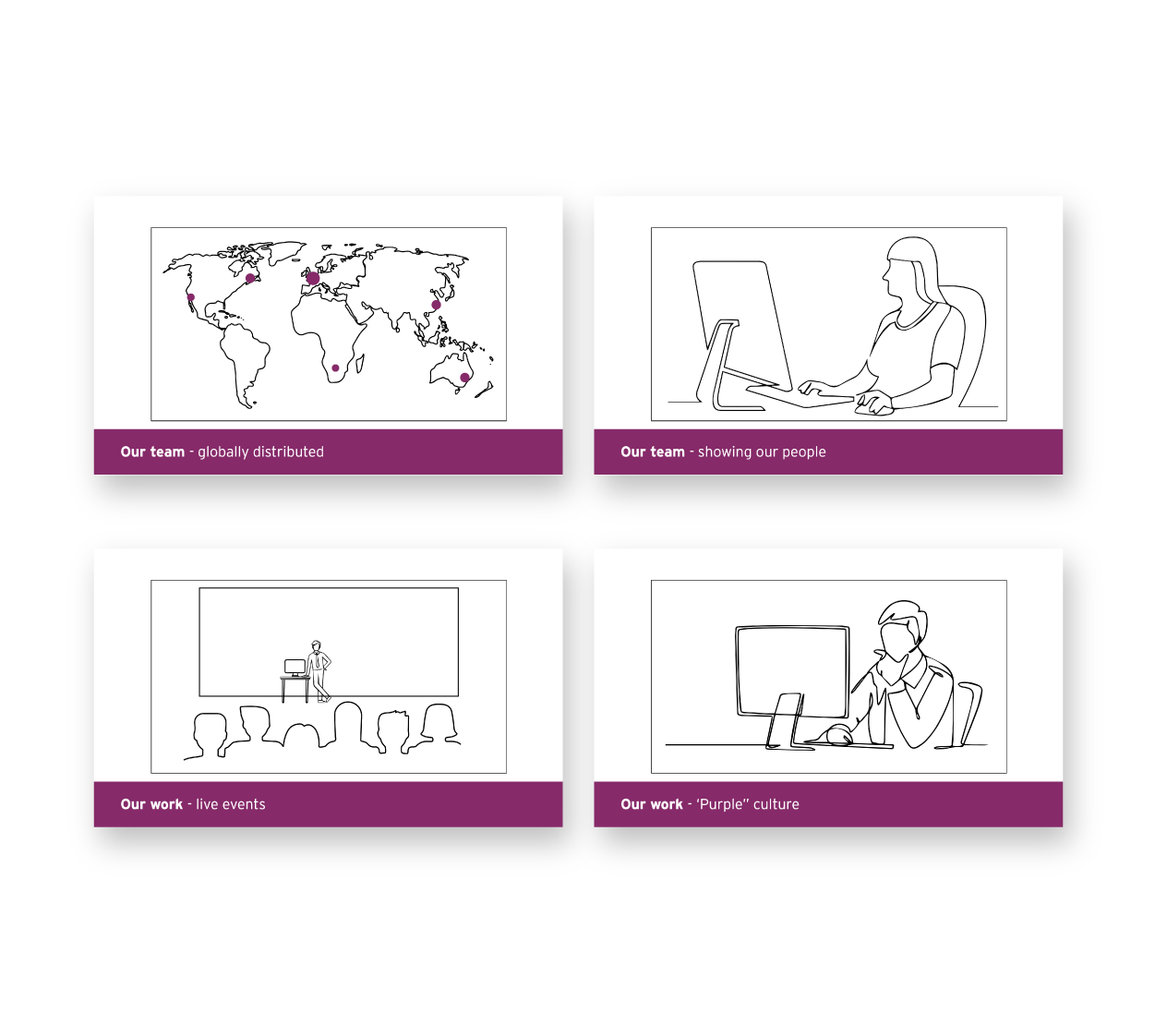
Founded in Australia, the company is a global leader in financial and governance services, operating in 21 countries. They not only care about the work they do, but also about people and the planet. Computershare's sub-brands include Deposit Protection Service (DPS), Letting Protection Service (LPS) and Georgeson. With tons of data, information and content, 'visual flavours' are a must to help present and understand their work.

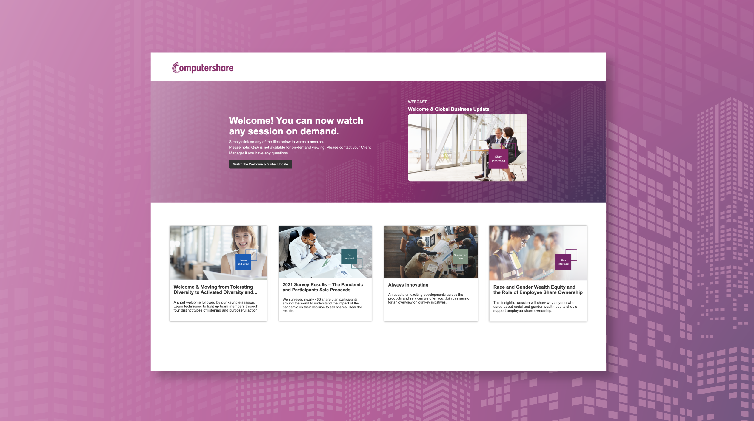
WEBINAR re-design
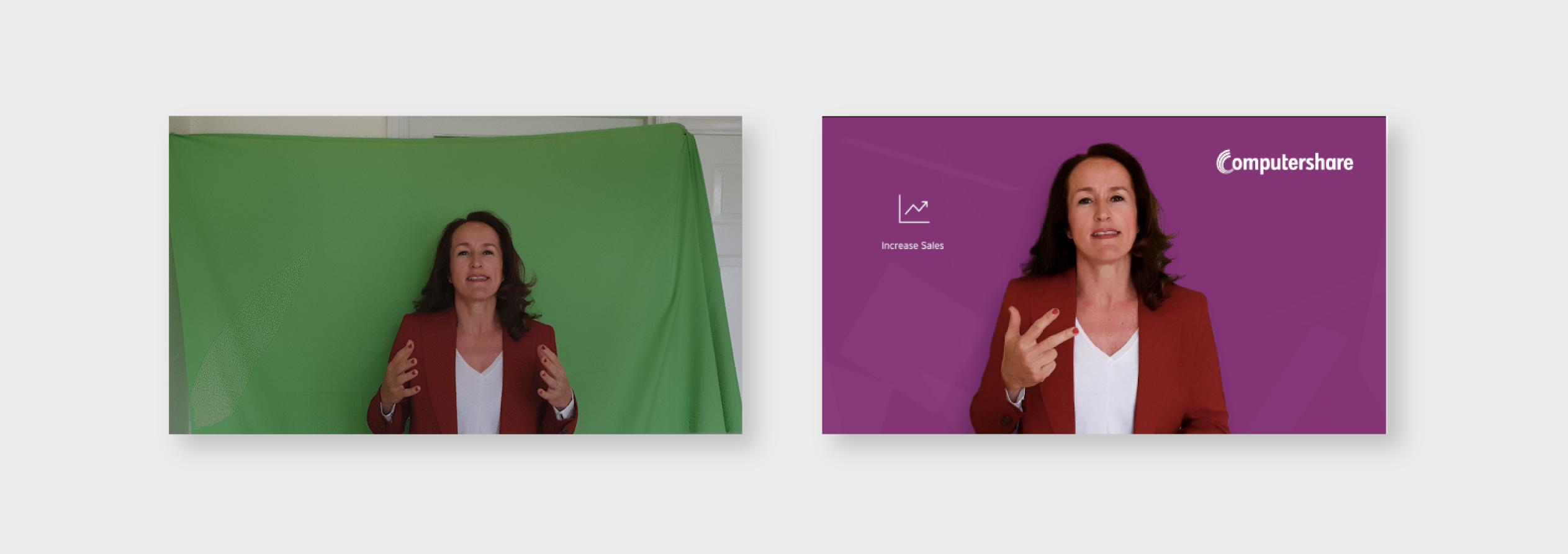
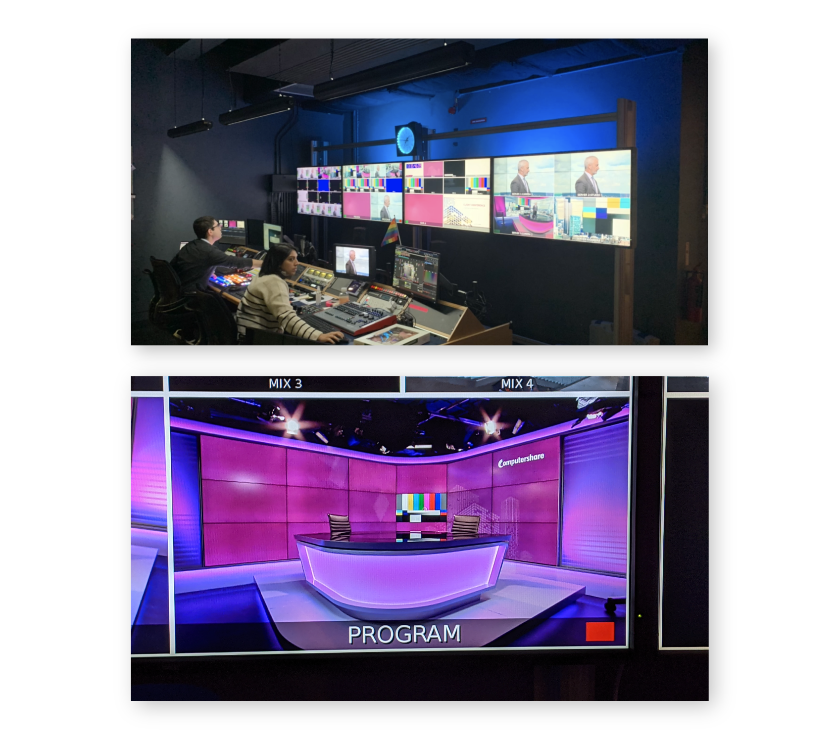
For the online event pictured above, assets had to be given an upgrade to upkeep with moving trends. The graphic theme was rectangular squares that form buildings, these were restructured and a new colour combination was introduced. Icons for the webinar topic categories were also retouched following a dimensional approach that would fit into the shaped theme. The re-design created a modern look for the webinar.
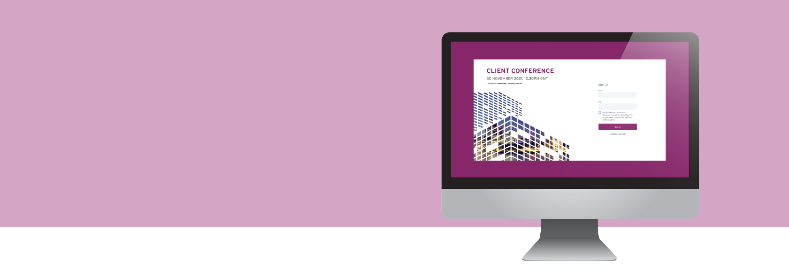
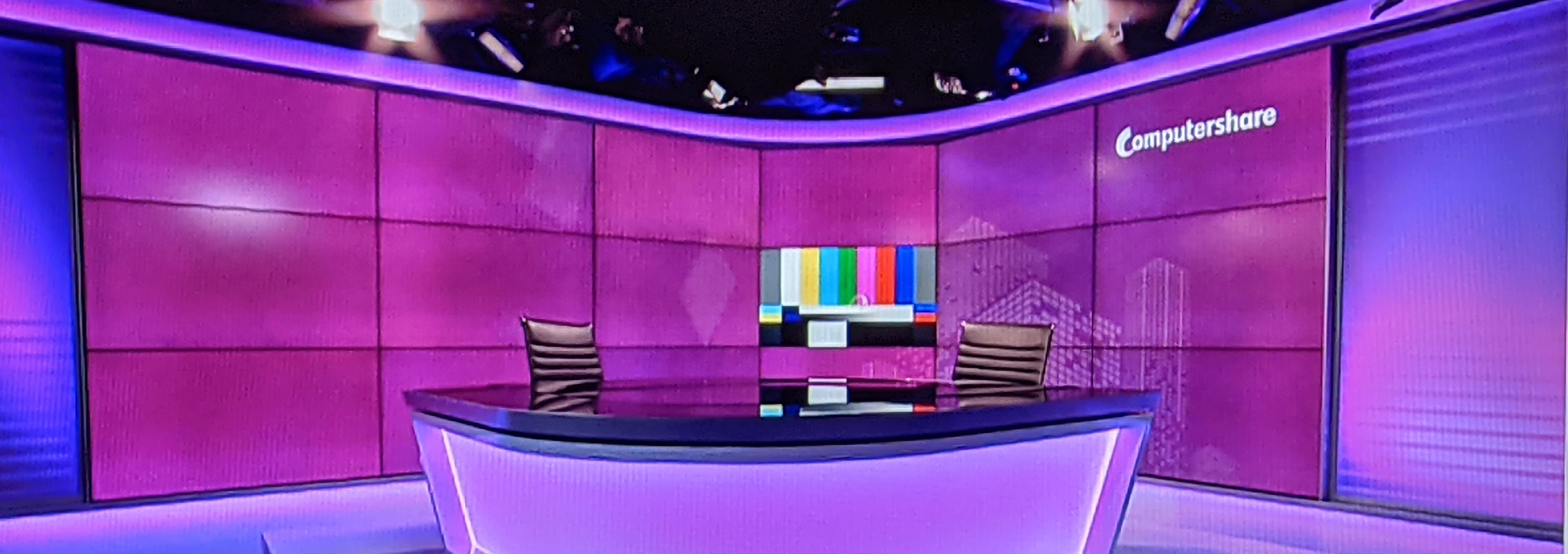
Webinar assets
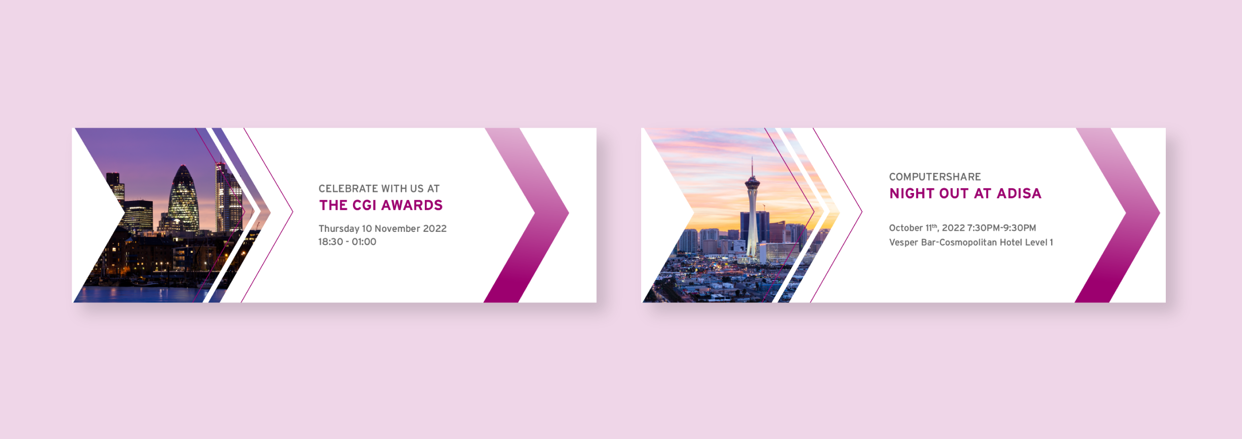
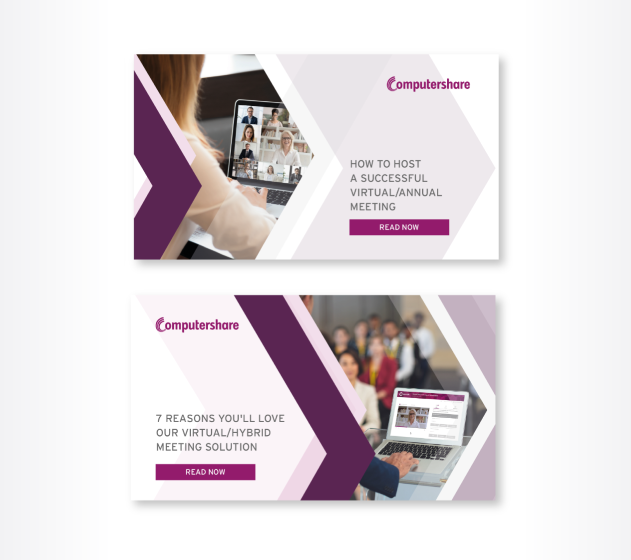
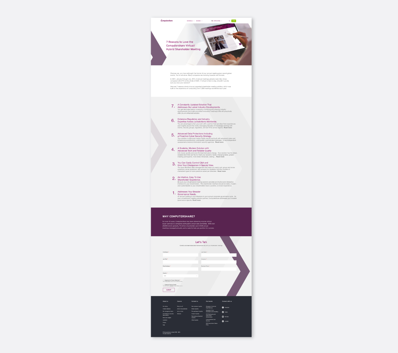
In 2021, the 'focus forward' webinar also needed to be redesigned to look modern and at global level. The assets, including a landing page, social media and email banners, were all designed to match the updated style.
Design refresh
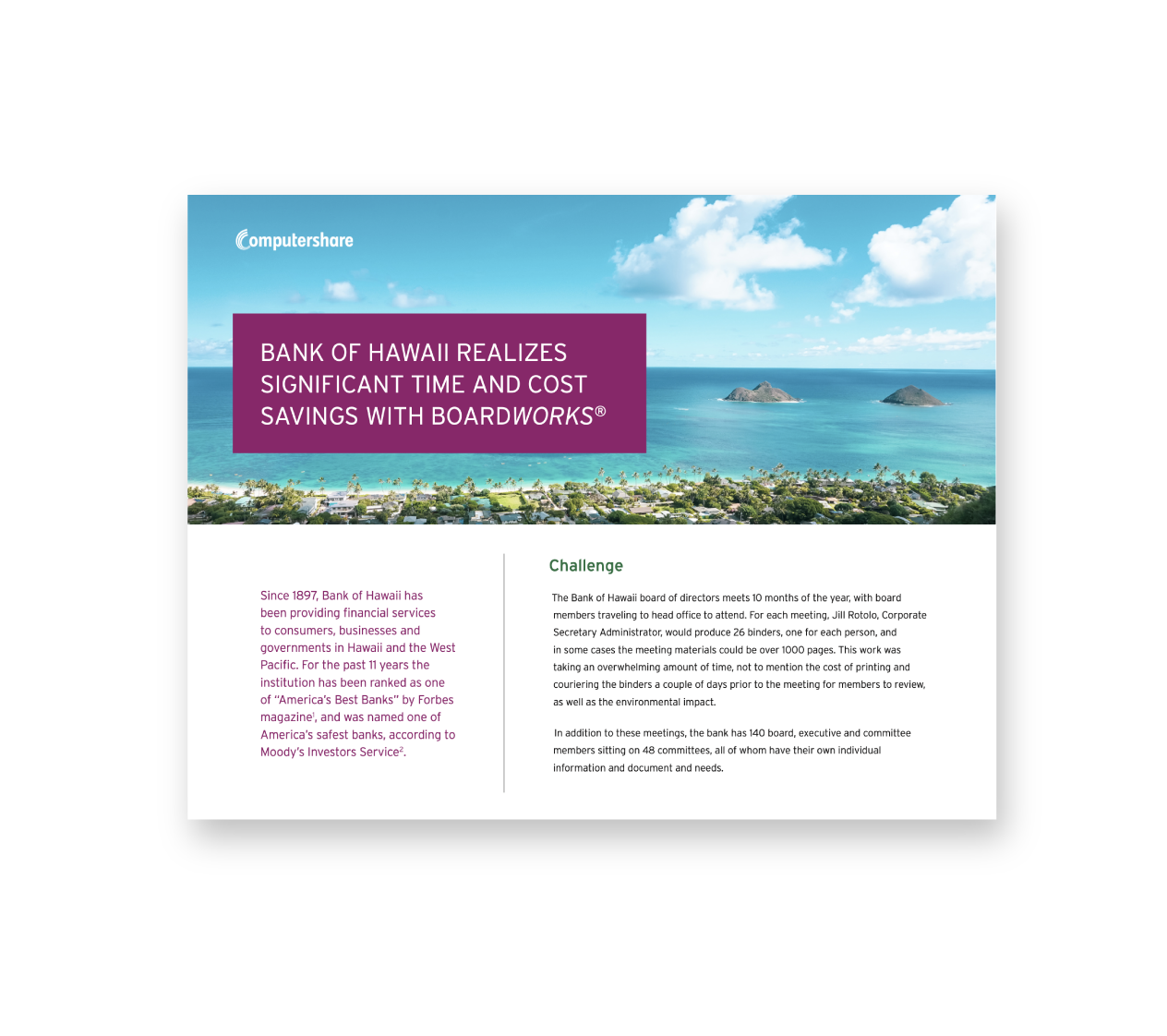
In 2022, the 'focus forward' campaign needed a brand refresh once again but in a way that wouldn't be too far off from the previous year. Some playful shades and shapes were explored, but in the end the delicate and classy style was chosen like below.

